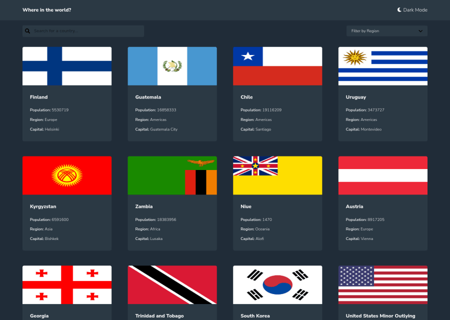
rest countries api challenge with react.js
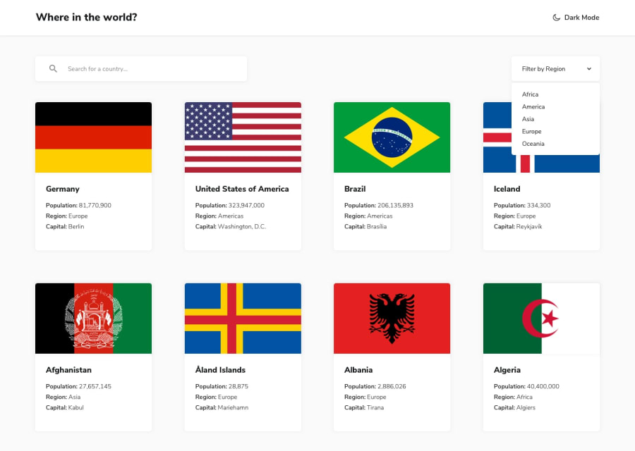
Design comparison
Solution retrospective
Had a hard time figuring out using flex alone for responsiveness of the cards while still maintaining their width on different screen sizes (min-width and flex wrap) and resorted to using media queries which felt a bit hacky.
Community feedback
- @mattari97Posted about 2 years ago
Hello Adepoju Adeyemi Joshua. Congratulations on completing this challenge 🎉. It is really well made so good job overall!
I have some small suggestions for you regarding minor problems:
-
You should probably try to rethink you layout using grid. It is the perfect opportunity to use this awesome CSS property. The design is a lot of very similar cards in a repetitive order which is a perfect match for grid. This awesome article will help you get started.
-
You forgot to update some styles on dark mode like the icons & color of the font in your
input-div -
I would use a
<header></header>element instead of a<div class="header"></div>for your header which would add more semantic value to you HTML and fix a lot of warnings in the report of your solution. -
I would add a link on the
Where in the world?text which redirects to the homepage. This is a feature everyone expects on a website nowadays and really quick to implement. -
I see that you used h4 tags for all your titles. I guess you did it for a styling purpose (in this case the font-size) but this is not a good practice. heading tags should have a logical order in the page. First a single h1 then one/multiple h2 etc... Then you would style them using CSS according to your needs. This is especially important for accessibility.
-
Lastly regarding the images of the cards on the home page; I would add a min-height to make them look closer to the design and also add the property
object-fit: coverto prevent any distortion.
Fell free to ask any question if you have some trouble fixing some of these issues.
Again good job with your solution and happy coding.
Peace 😊
Marked as helpful1@The-indigoPosted about 2 years ago@AntoineC-dev Hi Antoine, Thank you for your detailed feedback. I haven't really tried out using grids but i hope to follow the resource you posted and try it out. Also regarding the minor changes and fixes reccomended, i will go ahead and do that. Thank you this was really helpful.
1 -
- @TobianointingPosted about 2 years ago
Hello Boss, nice job 👍 especially on that dark mode to light toggling feature I am going to try something out relating to that soon. However, I noticed that on the app when I select a region I can't search for countries in that region the results page goes blank I think you didn't notice this. Nevertheless, that was a very nice job boss 👍.
0@The-indigoPosted about 2 years ago@Tobianointing Hi tobi, thank you for your feedback. I truely didn't notice this bug after making the submission. i will fix that soon. Thank you for bringing it to my attention and goodluck in implementing the theme toggle feature.
0
Please log in to post a comment
Log in with GitHubJoin our Discord community
Join thousands of Frontend Mentor community members taking the challenges, sharing resources, helping each other, and chatting about all things front-end!
Join our Discord
