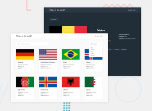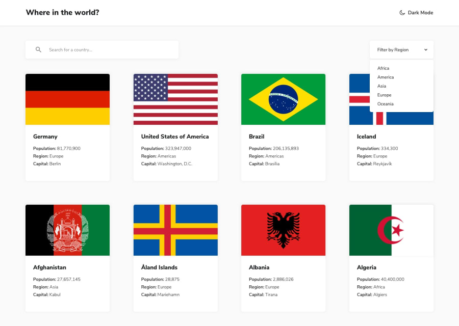
Design comparison
Solution retrospective
Can you spot any issue I should fix?
Community feedback
- @ayeyaiyaiPosted about 1 year ago
Looks good! When you set the grid-template-columns it looks like you're doing so in a way that creates 5 separate columns no matter the width of the window. This can cause issues if your screen's width isn't wide enough to display all 5 columns, and will result in some of the columns being off screen and inaccessible. A potential fix would be to use repeat function:
grid-template-columns: repeat(auto-fit, minmax(/minimum size for each column/, [/maximum size for each column/));
This would dynamically determine the number of columns based on the width of the window.
0@ifarontiPosted about 1 year ago@ayeyaiyai it's 5 columns for desktop only. The design image is 4 for 1440px width. But I wanted to do it full screen for desktop so I added 1 extra. I also wanted to use the card size as in the design image.
I used media query to change the fractions instead of changing size of card which may require changing some other details on the card.
But your suggestion will be used for my CSS in future as I think it's a great tip for overflow scroll
0
Please log in to post a comment
Log in with GitHubJoin our Discord community
Join thousands of Frontend Mentor community members taking the challenges, sharing resources, helping each other, and chatting about all things front-end!
Join our Discord
