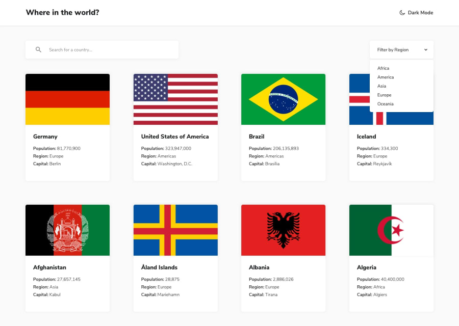
Design comparison
SolutionDesign
Solution retrospective
Feedback and criticisms are welcomed.
Community feedback
- @pikapikamartPosted about 3 years ago
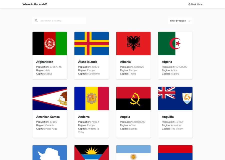
Hey, great job on this one. Layout in desktop looks nice, the responsive state could be improve since resizing, the cards gets squeezed, you could have just a different layout like 2x2, 3x3 on screen resize. This way, each card won't be squeezed, because it will have a right size. The mobile layout however makes the card thin, too much
paddingare used.Some suggestions would be:
- "Where in the world" doesn't really look like an anchor tag for this one. So it could just be using heading tag or
ptag instead ofatag. - Your color theme toggle works, but just using plain
buttondoes not provide any extra information about the on what thisbuttondoes. On this one, or in such cases that there are color theme toggle, a good structure would be to usefieldsetandlegendalong with theinput type="radio"inside it. A structure would look like:
<fieldset>
  <legend> { use a meaningful text, describe what the radio button does } <legend>
# inside here are the label and input elements
</fieldset>
Take a look at my solution on this one, inspect on the structuring of my color theme toggle.
- Always have a
mainelement on a webpage. This will wrap the main content of the webpage. For this one, you could just replace thesectionelement with themain. Along with an heading tag inside themainto which will be using screen-reader only stylings, describing themainsection contains or all about. - The icon on the
inputcould have just been used as abackground-imageof theinputelement. Theinputelement as well needs to have alabelelement on it or anaria-labelattribute, both describes what theinputdoes. - Your interactive elements lacks visual indicator. If you remove the
outlineprop on an element, you remove the default indicator on it. Try using tab key in your keyboard, you won't see on where you are in your website, because there aren't any visual. If you remove it, make sure to add on the:focus-visiblestate, on theinputand theselect. - Also, the
inputfor the search a country does not work. - The
altvalue for each of the country card should use the name of the country as the value. - Those overview information about the country, on the country card should be using
ulelement, since it is a "list" of informations.
VISITING A COUNTRY
- Again, the
altvalue for the country should be its name. - Those information as well should be using
ulelement. - Also, you forgot to add the border-countries section for each of the country.
Aside from those, great job again on this one.
Marked as helpful0 - "Where in the world" doesn't really look like an anchor tag for this one. So it could just be using heading tag or
Please log in to post a comment
Log in with GitHubJoin our Discord community
Join thousands of Frontend Mentor community members taking the challenges, sharing resources, helping each other, and chatting about all things front-end!
Join our Discord
