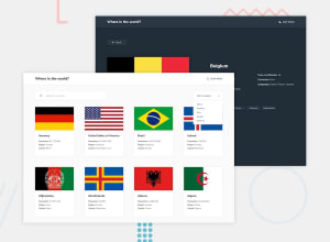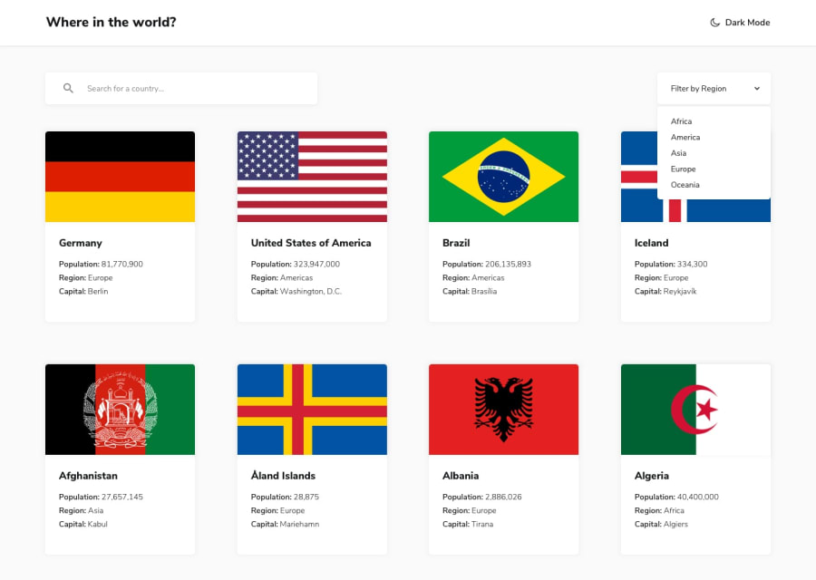
Design comparison
Solution retrospective
I'm stuck with showing the modal when any country card gets clicked. Could anyone please shine some lights. Thanks a lot.
Community feedback
- @shashreesamuelPosted almost 3 years ago
Hey good job completing this challenge.
Keep up the good work
Your solution looks great however I think that for the dark theme the card title and description should be white for easier readibility
In terms of accessibility issues simply wrap all your content between main tags
In terms of validation errors, attribute href not allowed on element div at this point, this means that the div element has no href attribute
I hope this helps
Cheers Happy coding 👍
Marked as helpful0 - @besttlookkPosted almost 3 years ago
Hi,
After looking into your solution, i found out a lot of but which i would like to point it out. 1.In light mode, there is no contrast in both filter and search w.r.t background. Try adding some shadow. 2. Somehow i am not able to click on individual country card to see its detail. I wonder if you have implemented it or not. 3.Are you making a new network for filtering and search?? why bother if you already have all the countries list during initail load. Filter through that only. 4. I would also love to see some hover effect on cards to make it interactive. 5. Also give some max-width for the content area. On wide screen it spread all over the screen , which dows not look good(in my opinion).
I am no expert but happy to help if you need any help. let me know.
Also, here is my solution: https://rest-countries-fem-v2.herokuapp.com/
Do let me know if you find any bug in mine.
Good Luck, #happyCoding
Marked as helpful0
Please log in to post a comment
Log in with GitHubJoin our Discord community
Join thousands of Frontend Mentor community members taking the challenges, sharing resources, helping each other, and chatting about all things front-end!
Join our Discord
