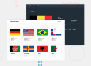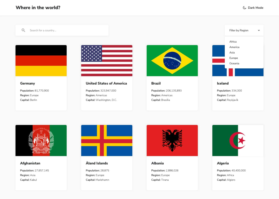
Design comparison
Community feedback
- @GelianthusPosted over 1 year ago
Hello, I took a look at the site and found an issue where the background doesn't extend all the way to the bottom when there is not enough content to render. Here is a screenshot, img. This error could be prevented by adding a min-height of 100vh to your app.
I've also noticed the lack of error handling. The problem with the API that is provided by the challenge is that, it also return countries from Antarctic region where there is a lot missing data. It could cause the website to break if a user clicks on them. Much like what you did when a country doesn't have a border, I would also suggest doing the same for countries that are from Antarctic region. Here's what it looks like if the website fails to retrieve data, img2.
Error handling could be as simple as checking whether a data is available.
const countryPopulation = document.getElementById("countryPopulation");

if (country.population) {
return countryPopulation.textContent = country.population;
} else {
return countryPopulation.textContent = "No inhabitants";
}
Hope this helps!
1@OlatoyanPosted over 1 year ago@Gelianthus
Alright, thanks so much, I'll fix them.
0
Please log in to post a comment
Log in with GitHubJoin our Discord community
Join thousands of Frontend Mentor community members taking the challenges, sharing resources, helping each other, and chatting about all things front-end!
Join our Discord
