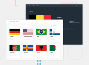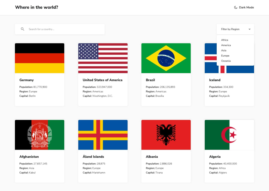
Design comparison
Solution retrospective
okay
What challenges did you encounter, and how did you overcome them?okay
What specific areas of your project would you like help with?okay
Community feedback
- @TedJenklerPosted 3 months ago
Hi @ARPIT73881,
Great job on the project! The card shadows are a nice touch, and I appreciate the detail with the border country buttons showing real names(many overlook that).
However, I noticed a few areas for improvement:
Responsiveness: The layout isn't responsive, likely due to using Flexbox. Consider switching to CSS Grid for better adaptability and fine-tune the card sizing.
Card Hover Animation: Adding a hover animation to the cards would enhance the visual appeal and interactivity.
Custom Select Components: Customizing select components with hover effects and animations is crucial for frontend development. This would polish the project further.
Navbar Responsiveness: The navbar isn't responsive when certain countries are selected. It’s worth addressing for consistency.
Overall, solid work with some room for enhancement. Hope this helps!
Best, Teodor
Marked as helpful1 - @ARPIT73881Posted 3 months ago
sure , i will try by best to implement your suggestions .
0
Please log in to post a comment
Log in with GitHubJoin our Discord community
Join thousands of Frontend Mentor community members taking the challenges, sharing resources, helping each other, and chatting about all things front-end!
Join our Discord
