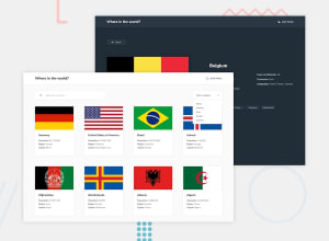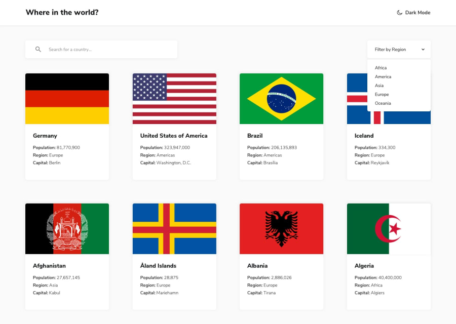
Design comparison
Solution retrospective
I didn't follow the exact design spec added my own little flavor to this project. I really enjoyed working on this and can proudly say I can take a lot away from this.
Community feedback
- @ChamuMutezvaPosted almost 4 years ago
Welldone on this project. The desktop version is awesome, however the mobile version still needs some polishing up as one has to scroll sideways to see all the information that is being displayed. The Theme mode is perfectly working. The search function is not correctly working as i cannot perform a search and to get the display data back on screen after searching i had to reload the browser as i could not see another option. The data presented is just for a few countries probably because you used a different api than the one in the challenge. Good work on the modal as well. In addition i would look into presenting the bordering countries as full names instead of the abbreviations . Happy coding
1@Medici305Posted almost 4 years ago@ChamuMutezva Really appreciate the advice. This exactly what I needed to hear and I will get on making those changes ASAP. Again thank you!!
0 - @abhik-bPosted almost 4 years ago
great job on this challenge 👌👌
- theme transition is smooth
- I like the modal ,it looks good
- filtering also works great
- hovering on cards is really amazing
Overall great job, Keep it up
0@Medici305Posted almost 4 years agoThank you very much, honestly for someone to take a portion of their time and review my effect it means a lot.
1
Please log in to post a comment
Log in with GitHubJoin our Discord community
Join thousands of Frontend Mentor community members taking the challenges, sharing resources, helping each other, and chatting about all things front-end!
Join our Discord
