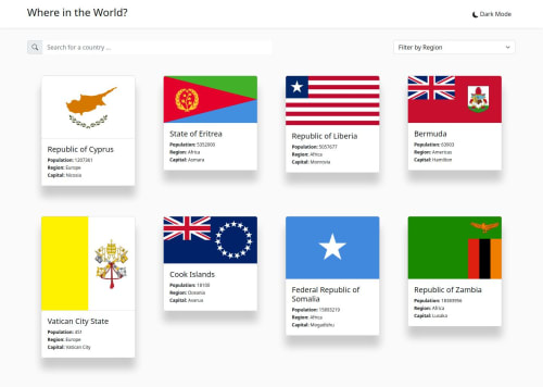
REST API Countries Switcher with Theme Toggle

Solution retrospective
Hi , I am really happy that after I initiated the challenge, I was able to complete it. Although having 3 years of in React, I always learn something new whenever I do such challenges.
I gave my best to keep up with DRY principles and do clean code. But, there always scope of improvement. So, please feel free to suggest or comment anything new that could enhance this project further. I would be happy to work and accept contributions on the same :)
Github Repo : LINK
Project : LINK
Other Challenges completed by Me : LINK
What challenges did you encounter, and how did you overcome them?I didn't encounter much challenges, only tried to maintain clean code practices and keeping up with the DRY principles.
What specific areas of your project would you like help with?I think enhancing the project by including more challenging features will not only increase my learning curve, but also make the project much better. So, I would really appreciate if you have any new ideas to make this project even better !
Please log in to post a comment
Log in with GitHubCommunity feedback
No feedback yet. Be the first to give feedback on Dushyant Goyal's solution.
Join our Discord community
Join thousands of Frontend Mentor community members taking the challenges, sharing resources, helping each other, and chatting about all things front-end!
Join our Discord