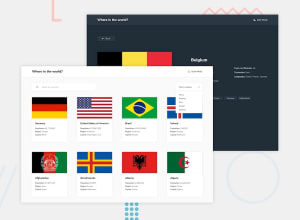
Design comparison
Solution retrospective
Good day Frontend Mentor Community! Here is my solution to the Rest API Countries with Color Theme Switcher challenge.
I was able to code and complete another challenge after being out for a while but here is my craft once again. In this challenge, it's more on applying my knowledge and utilizing other libraries to complete the task and my workflow is continuous at this point. I focused more on cleaning my code and doing all the necessary features in this challenge and it was a success.
Features accomplished:
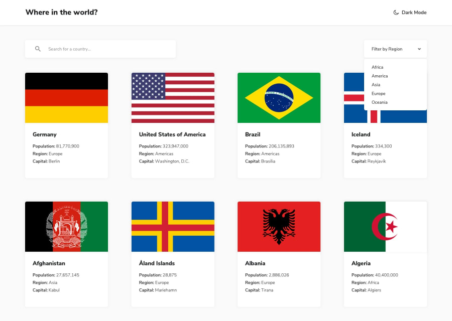
- filtering countries by search input and region
- theme switch to dark or light mode
- error messages on pages with errors
- filtering layout animation when search input or region changes
- utilized pagination and skeleton loading for better user experience
Here are the main problems/features I wasn't able to accomplish:
- filtering with different search input must show exact countries based on it (e.g. "Manila, China" should show both Philippines and China). It could be done with regex but did not bother to try it.
- when typing fast, both filtering and its animation gets visual error and may show wrong countries. This is because of having to filter large data set every keypress which is quite expensive. One solution I think of was adding delay but was not able to do it. If there are any ideas how to fix it let me know!
Working on different edge cases is quite tedious and requires a lot of work. But I am all ears to any feedbacks and advices you guys could offer. Have a nice day everyone!
Community feedback
Please log in to post a comment
Log in with GitHubJoin our Discord community
Join thousands of Frontend Mentor community members taking the challenges, sharing resources, helping each other, and chatting about all things front-end!
Join our Discord
