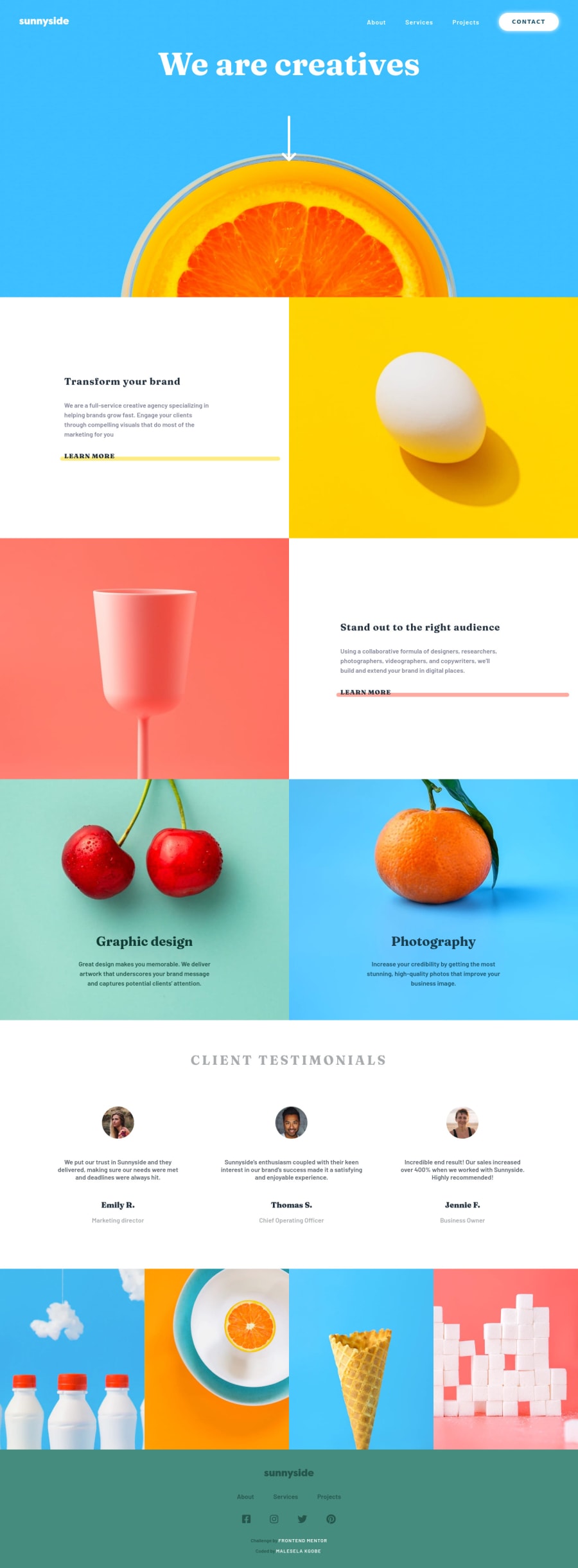
Not Found
Not Found
Not Found
Not Found
Not Found
Not Found
Not Found
Not Found
Not Found
Not Found
Not Found
Not Found
Not Found
Not Found
Not Found
Not Found
Not Found
Not Found
Not Found
Not Found

Submitted

Resposnsive landing Page using Vanilla JS/CSS/HTML

@M-Kgobe

Desktop design screenshot for the Agency landing page coding challenge

This is a solution for...

  • HTML
  • CSS
  • JS
2junior
View challenge

Design comparison


SolutionDesign

Solution retrospective


Feedback regarding the hamburger would be appreciated. At times when I click it, it does not change. The devTools do confirm that it has been clicked, but then the classes it is suppose to toggle(), are not being toggled, so if such does happen/ and might have a solution please let me know. Thanks in advance

Community feedback

@pikapikamart

Posted

Hey, great work on this one. Made a different approach on the layout I see, and it seems fine, just some transitions are bit slow. Layout in mobile, there is a bug, try seeing the layout in desktop, and then change the screen size in dev tools, you will notice that the mobile layout can't be scrolled and it shakes up.

Some other suggestions would be:

  • You don't need width: 100% on the body, block elements have default of width: 100%.
  • I wouldn't put the sunnyside logo inside the nav element. nav element should contain those navigational links, like about us, services and the sunnyside is not a navigational link, even if you made it a a tag, it shouldn't be inside the nav.
  • On the sunnyside logo, it should use alt="sunnyside" the image itself have the text inside it, better using it in the alt attribute. Also, avoid using words that relates to "graphic" like "logo, icon, image..", assistive tech will handle those for you.
  • I wouldn't use a scaling unit on the height on your header element, because right now, if you inspect in dev tools at the bottom, you will notice that the element's height is small because it doesn't really have a content inside it with proper dimension, and the height unit is scalable. Use rem on the height so that it will have a fixed height on it.
  • Also, the hero-section, the we are creatives I wouldn't really add that on the header, that would be in the main element.
  • The arrow-down icon should use alt="" on it. If an image is just decoration, use empty alt="" but if the image adds content then use a meaningful alt value.
  • All those learn more should be inside a a tag because those are supposed links for every section.
  • For this website, seeing the images, I would use alt="" on all of it except for the sunnyside logo and the testimonial images, since all of it doesn't really add any and just pure decoration. Better yet, you could just use them in the background-image property.
  • The alt value for every testimonial images should have been their names like alt="Emily R", when you encounter testimonials, always use their names as the alt values o the images.

FOOTER

  • The sunnyside svg should have included a:
<title> sunnyside </title>

inside it, this way assistive tech will know that this svg is all about.

  • Each social media links a tag should have used aria-label to which the value is the social media name, for example on the facebook link:
<a aria-label="facebook"> icon in here </a>

This way, users will know where this link would take them because of the aria-label. You use this attribute when there is no text content that an assistive tech could read on the html element.

MOBILE

  • The hamburger toggler should use button element and not div. Using button will make it more accessible. The button should also have:
<button aria-label="hamburger menu toggler" aria-expanded="false" />

The aria-expanded should be toggled either true or false via javascript, if the user toggles the button or not.

  • The html ordering is also wrong, the button should be first before the dropdown elements.
<button />
<list of links />
  • Also, when having a dropdown, do not just use transform: scale(0) on the element just to hide it, this will hide it visually but this will still be picked up by assistive tech even if the user did not toggled it. You don't want the user to be confused on why they are getting those elements, even though that they didn't toggled the toggler.

It might be a lot, but it is fine to be aware of these things. Still, great work.

Marked as helpful

0

Account Deleted

Hi,

Your solution looks pretty, the extra features that you implemented make it stand out pretty good.

  • How the navigation changes on scroll looks pretty nice, even the scroll bar looks slick.
  • & I'm not sure why the hamburger doesn't work at times, to me it works but not when I enter developer tools.

Keep coding👍.

Marked as helpful

0

Please log in to post a comment

Log in with GitHub
Discord logo

Join our Discord community

Join thousands of Frontend Mentor community members taking the challenges, sharing resources, helping each other, and chatting about all things front-end!

Join our Discord