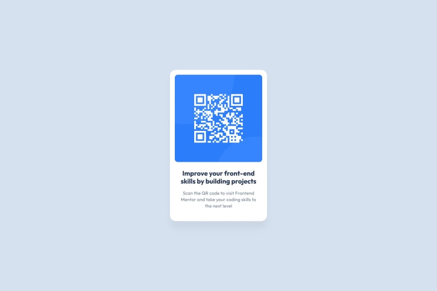
Design comparison
Solution retrospective
I'm very proud of the fact that I was able to make the site without any problems and I'd do things differently next time, I'd make the site more responsive.
What challenges did you encounter, and how did you overcome them?For some reason I couldn't center the white square at first. But over the course of development it was fixed.
What specific areas of your project would you like help with?For now, with JavaScript, but that's not the case for this particular site. In the future, after learning Next.js, I plan to move on to the back-end using Rust.
Community feedback
- @code-crasherPosted 6 months ago
-Hey buddy good work so far your solution is not bad infarct it is better than mine when I first started but can I make some few suggestions if you don't mind. 1 For accessibility reasons any site needs to have one
<main>tag which apparently
you don't have. 2 I would go for placing the card component inside a<article>tag since I believe it can be reusable in other parts of the code and it does not depend on anything else in the code. 3 The image is not supposed to be wrapped in a link tag since it is not alinkMarked as helpful2 - @jsupasilPosted 6 months ago
Very good, the components are fit to the prototype. From my personal opinion, i would prefer the bottom component have the same background color as the task. It will make the page look smoother. However, the work is perfect!
Marked as helpful0
Please log in to post a comment
Log in with GitHubJoin our Discord community
Join thousands of Frontend Mentor community members taking the challenges, sharing resources, helping each other, and chatting about all things front-end!
Join our Discord
