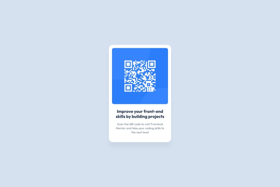
Design comparison
SolutionDesign
Community feedback
- @DiegoGuaglianonePosted 7 months ago
You just forgot to change the font color and weight, but the rest of the code looks very good.
Marked as helpful0 - @shaleenchowdharyPosted 7 months ago
Most of the things are good but I think: 1st. You should use separate CSS file for more structured approach. 2nd. You should use bold title with blue color below the QR code for more similarity with the original design.
Rest of the stuff is super great. Best of Luck mate.
Marked as helpful0
Please log in to post a comment
Log in with GitHubJoin our Discord community
Join thousands of Frontend Mentor community members taking the challenges, sharing resources, helping each other, and chatting about all things front-end!
Join our Discord
