

Design comparison
SolutionDesign

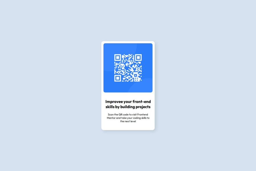
Solution retrospective
What are you most proud of, and what would you do differently next time?
knew what to do
What challenges did you encounter, and how did you overcome them?position card vertically - ChatGPT
What specific areas of your project would you like help with?is the overall code structure (the html elements and corresponding css classes) sensible
Community feedback
- @BlackpachamamePosted 27 days ago
Hey your solution is amazing! 🤩
📌 Some accessibility and semantics recommendations for your HTML
- To improve the semantics of your HTML, you can change your
<div class="container">to a<main class="container"> - Use
min-heightandmax-width, this will help the content stretch or shrink if you need to. Unlikeheightandwidthwhich can cause your content to be cut off on certain screens. For example, usemin-height: 100vhinstead ofheight: 100vh - You can apply
display: blockto the image to remove the white space generated underneath. Although visually in this case it is irrelevant, it helps you better calculate the space with other elements - You forgot to add the corresponding colors to the texts
0 - To improve the semantics of your HTML, you can change your
- @LucasOrtiz5Posted 27 days ago
It is quite well done, the size is a little smaller than the original design and the color of the letters is not appropriate. the rest very good. The image and semantics of the HTML are correct. On the other hand, regarding the use of CSS, it is well implemented separately for each part of the letter as it should be. good job!
0


Please log in to post a comment
Log in with GitHubJoin our Discord community
Join thousands of Frontend Mentor community members taking the challenges, sharing resources, helping each other, and chatting about all things front-end!
Join our Discord