Not Found
Not Found
Not Found
Not Found
Not Found
Not Found
Not Found
Not Found
Not Found
Not Found
Not Found
Not Found
Not Found
Not Found
Not Found
Not Found
Not Found
Not Found
Not Found
Not Found

Submitted

Resposive Manage Landing Page using (HTML, SASS, Bootstrap 4, jQuery)

@MohMostafa-Web

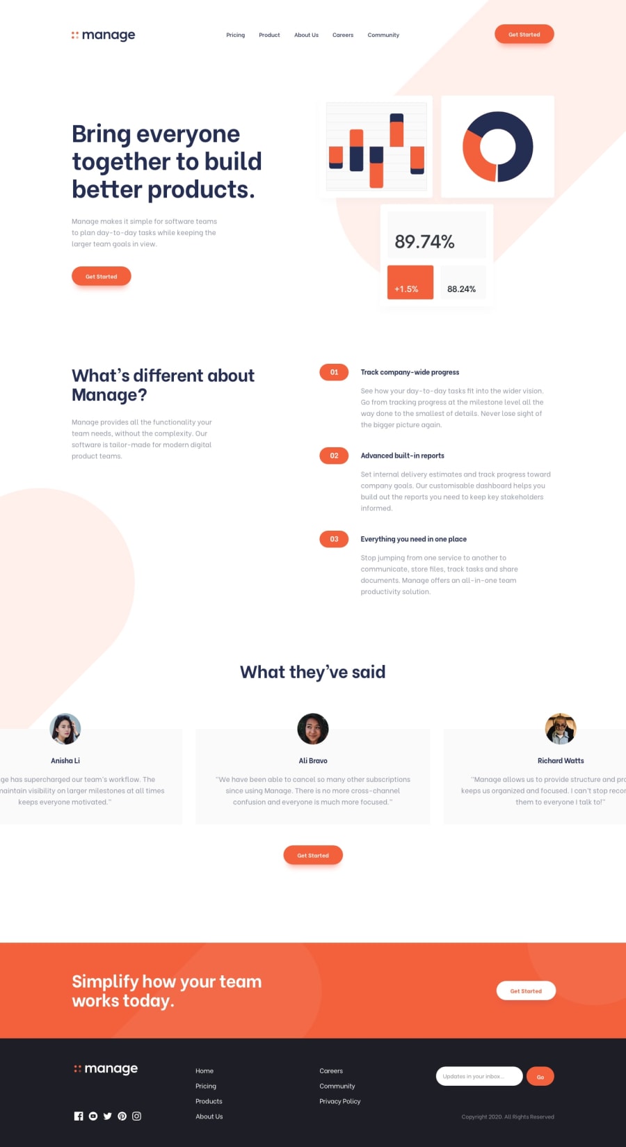
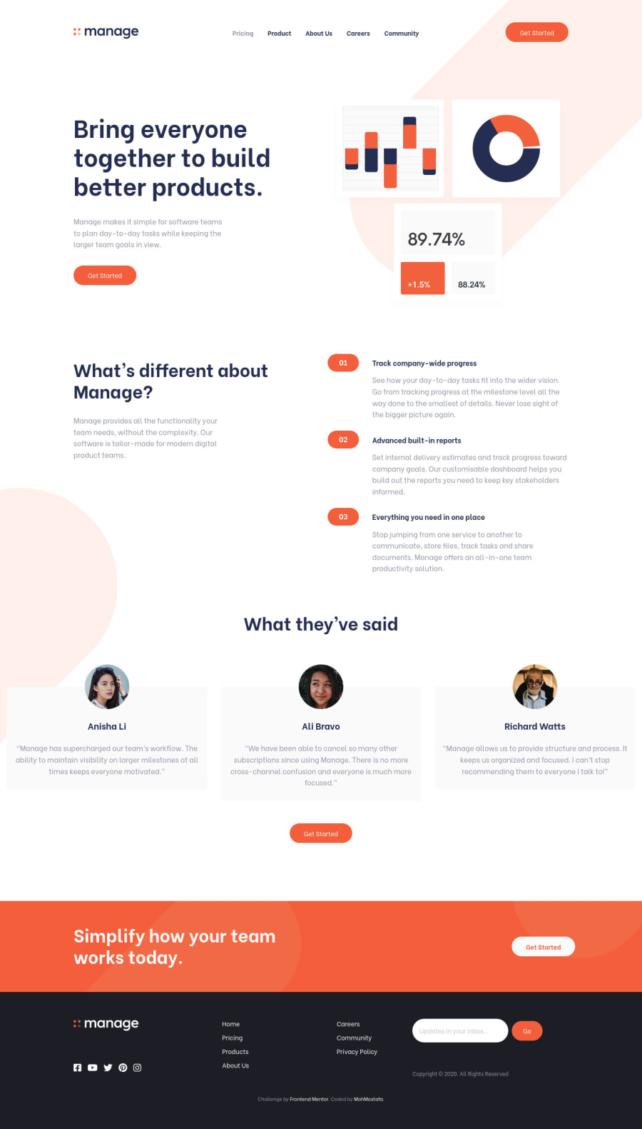
Desktop design screenshot for the Manage landing page coding challenge

This is a solution for...

  • HTML
  • CSS
  • JS
3intermediate
View challenge

Design comparison


SolutionDesign

Solution retrospective


Any feedback is welcome.

Community feedback

@MohMostafa-Web

Posted

Thanks so much for your suggestions

1

@pikapikamart

Posted

Hey, really awesome work on this one. Desktop layout looks really great, it is responsive and the mobile state looks really great as well.

Some suggestions would be:

  • It would be great to have this markup:
<header />
<main />
<footer />

This way, all element that has content are inside their respective landmark elements.

  • Also, I wouldn't include the hero-section inside the header, it usually only contains the top-most part of the site which include the logo, navlinks.
  • Website-logo- link a tag should either use aria-label or screen-reader only text inside it, that defines where this link would take the user. Since typically a website-logo links to homepage, use "homepage" as the value for what ever method you will use.
  • Website-logo img should be using the website's name as the alt like alt="manage". Remember that a website's logo is meaningful so always make sure it uses the proper alt value.
  • Also when using alt attribute, avoid using words that relates to "graphic" such as "logo, illustration" and others. An img is already an image/graphic so no need to describe it as one.
  • If you remove the outline property of an element, make sure to add another custom visual indicator on the element's :focus-visible state. Try using tab on your keyboard to navigate the site, you will have a hard time since there is no indication on where you at.
  • The hero-section image is really hard to tell whether it should be visible since it have like statistics showing or just hide it. Hmm
  • You could use ul on the .features-content since those are "list" of features of the manage.
  • Also, for those 01 and others , you could make use of pseudoelement like:
.test::after{
  content: "01";
  align-items: center;
  display: flex;
  justify-content: center;
 ....
  ......
}

So that it won't be pick up as a text-content when using screen-reader.

  • For each of the testimonial card, you could use this markup:
<figure>
  <img src="" alt="">
  <blockquote>
    {qoute in here}
  </blockquote>
  <figcaption>
    person name
    <p>
      person role
    </p>
  </figcaption>
</figure>

Then you could just use grid to place the content in their own row like on the design.

  • Also make use the person's name as the alt for the img.
  • Also when using alt attribute, avoid using words that relates to "graphic" such as "img, avatar" and others. An img is already an image/graphic so no need to describe it as one.

FOOTER

  • When using svg to give it an descriptive text, use this method:
<svg aria-describedBy="website-logo">
  <title id="website-logo">manage</title>
  ......
</svg>
  • You could just use only the social media name as the aria-label for each of the a tags.
  • You could use nav for the 7 links since those are still your navigational links, only they are secondary.
  • You should have use a single ul for those 7 links since they are all related to one another and just use grid to place each item properly.
  • Your input tag lacks an associated label tag on it. Since there are visible-label, the label would be a screen-reader only label, meaning it would make user of like sr-only class. The text-content should describe what the input needs like the value on the placeholder.
  • Use button type="submit" instead of input.
  • Right now, the error-message is only seen visually and not really linked to the input. To make it accessible, here is a pseudocode of the input should work:
if ( input is wrong )
  input.setAttribute("aria-invalid", "true");
  input.setAttribute("aria-describedBy", id of the error-message);
else 
  input.removeAttribute("aria-invalid");
  input.removeAttribute("aria-describedBy");

The error-message element should have an id attribute which is referenced by the aria-describedBy attribute on the input element. By doing that, your user will know that the input is wrong because of aria-invalid and they will know what kind of error they made because of the aria-describedBy

MOBILE

  • Those img that are inside the hamburger-menu should be hidden since they are just decorative. Decorative image must be hidden at all times for screen-reader users by using alt="" and extra aria-hidden="true" attribute on the img tag.

Aside from those, site looks really great and awesome work again on this one.

1

Please log in to post a comment

Log in with GitHub
Discord logo

Join our Discord community

Join thousands of Frontend Mentor community members taking the challenges, sharing resources, helping each other, and chatting about all things front-end!

Join our Discord