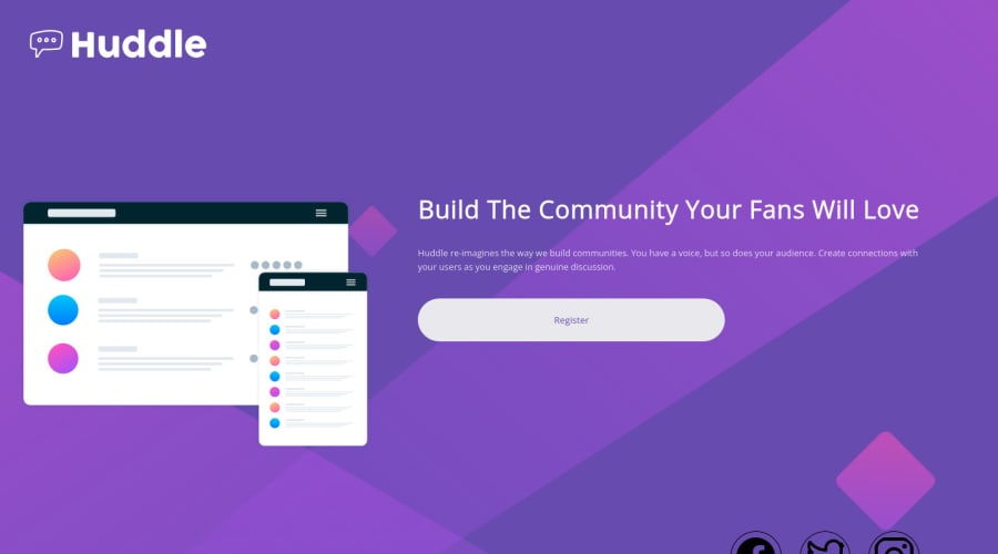
Design comparison
Solution retrospective
Feedback will be appreciated.Thank you(❁´◡`❁)
Community feedback
- @correlucasPosted over 2 years ago
👾Hello Ruchi, congratulations for your new solution!
Hey Ruchi, your solution seems good, I can see that you've done a good work here, if you fix the main section alignment and the icons will be even better. See my tips below:
To have a good size for the icons (they're too big) use a standard value as 32px or 24px. In this case is better 32px:
.icon {
    /* width: 1.5rem; */
    max-width: 32px;
    border: 1px solid rgb(0, 0, 0);
    padding: 1.5%;
    color: white;
    border-radius: 100%;
    margin: 2%;
}
Removing the paddings/margins you add to align the section and instead use
display: flexto align andmin-heigh: 100vhto make the body has 100vh as its size to align the child verticallybody { display: flex; min-height: 100vh; background: url(images/bg-mobile.svg) no-repeat 50% 0%,hsl(257, 40%, 49%); background-size: 100%; margin: 10%; animation-fill-mode: backwards; flex-direction: column; align-items: center; justify-content: center; }👋 I hope this helps you and happy coding!
Marked as helpful0
Please log in to post a comment
Log in with GitHubJoin our Discord community
Join thousands of Frontend Mentor community members taking the challenges, sharing resources, helping each other, and chatting about all things front-end!
Join our Discord
