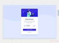
Design comparison
Solution retrospective
Any suggestions on how I can improve are welcome!
Community feedback
- @abdellahelaajjouriPosted over 2 years ago
Hi Medghazaly, great job!
I don't really recommend to use position absolute to centering you card you can use others methods that can be Responsive in all the devices so you don't face any problems , her is some methods you can use 1- .center { margin: auto; width: 60%; padding: 10px; 2- .parent { height: 200px; display: flex; align-items: center; justify-content: center; } 3- .parent { height: 200px; display: grid; align-items: center; justify-content: center; }
Hope this help :)
Marked as helpful0 - @denieldenPosted over 2 years ago
Hi Medghazaly, great job!
Add the hover effect in the button! To make mouseover cahngetry use :hover css
Hope this help :)
Marked as helpful0 - @Mahmoud2227Posted over 2 years ago
Hey @med-ghaza! Congratulations on completing the challenge.
Your solution looks pretty good but I think you forgot to add the hover states for interactive elements.
For the accessibility issues, you should consider using semantic elements.
0
Please log in to post a comment
Log in with GitHubJoin our Discord community
Join thousands of Frontend Mentor community members taking the challenges, sharing resources, helping each other, and chatting about all things front-end!
Join our Discord

