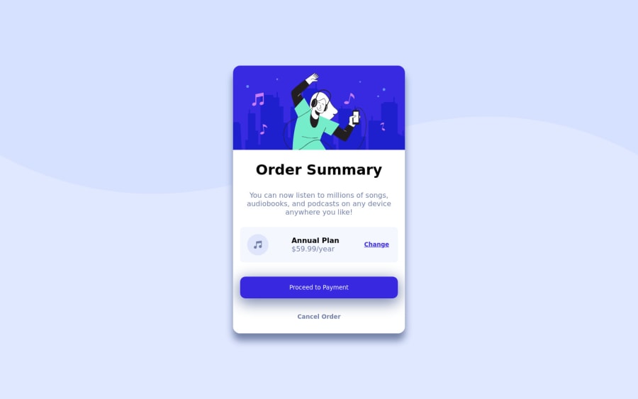
Design comparison
Solution retrospective
Learning React so any suggestions on it would be great also anything else you guys think could be improved, let me know.
Thanks :)
Community feedback
- @afrusselPosted about 3 years ago
As a first project good work. Your main container is not center aligns vertically. I would like to request you please take a look at my solution it may help you to find your issues
Marked as helpful2 - @webshurikenPosted about 3 years ago
I love that you took it a step further and did a React app. :)
My feedback is more on the CSS and HTML side of the project.
-
You need to use Semantic HTML to make the page more accessible, this is the reason for the issues in your report. Make sure you use
<section>or<header>. See HTML5 landmarks -
CSS, looking at the live site I noticed the component is not responsive. Between 568px and 1070px the elements inside the card dont fit. It would be good to have a look at your media queries.
Hope this helps somewhat :-). Have a good weekend
Happy Coding
Marked as helpful1 -
Please log in to post a comment
Log in with GitHubJoin our Discord community
Join thousands of Frontend Mentor community members taking the challenges, sharing resources, helping each other, and chatting about all things front-end!
Join our Discord
