Submitted over 1 year ago
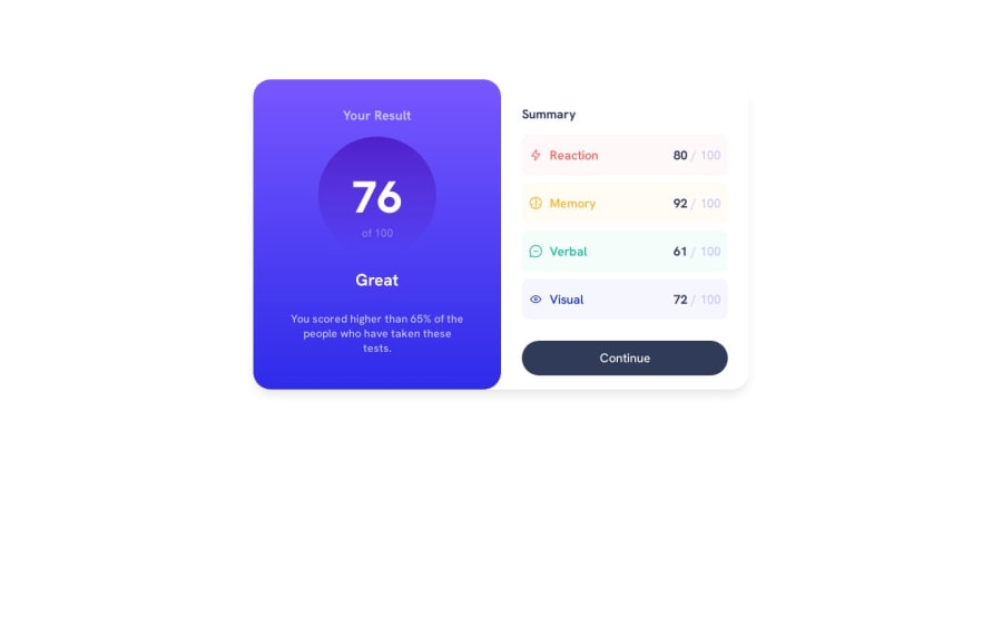
Responsive(to an extent) result summary component html and css
@kayode-dev
Design comparison
SolutionDesign
Community feedback
- @RabberpoliPosted over 1 year ago
Hi! Congratulations for completing your challenge! Just one thing:
heightandwidthproperties are fine on desktop resolution; but shrinking the window size I see that there is a resolution gap before mobile layout kicks in. In that gap components gets a little bit messy. In order to avoid this you can use media queries (more details here). Using media queries you can adjust card's width in order to contain everything until mobile responsiveness comes up. As another alternative, if you are using flexbox you can play withflexproperty (you can check flex documentation and flexbox in general).
Hope you will find it useful! Keep going and happy coding!
Marked as helpful0@kayode-devPosted over 1 year ago@Rabberpoli thanks for the feedback!
i’ll definitely adjust that
1@Nop-WangPosted over 1 year ago@Rabberpoli
Thank you very much for the feedback! This is my first time to try build webpage with myself.
1
Please log in to post a comment
Log in with GitHubJoin our Discord community
Join thousands of Frontend Mentor community members taking the challenges, sharing resources, helping each other, and chatting about all things front-end!
Join our Discord
