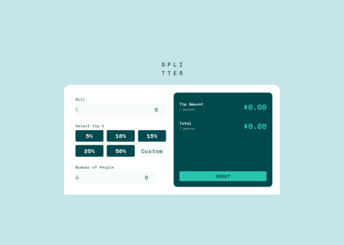
Responsives Tips calculator

Solution retrospective
Managing to get the JS working, was a nice little feature for this.
What challenges did you encounter, and how did you overcome them?Mostly around the background image icon i could not really find a solution to adding padding , i've encountered this before and not really found a solution that works.
The buttons and constraining the widths were a bit more tricky too. Additionally i wasn't able to find a way to have the last input field the same width as the other parts of the component.
What specific areas of your project would you like help with?Help with the icon in the input fields as well as width for the second input element. JS syntax CSS responsiveness.
Please log in to post a comment
Log in with GitHubCommunity feedback
No feedback yet. Be the first to give feedback on Aaron Smith's solution.
Join our Discord community
Join thousands of Frontend Mentor community members taking the challenges, sharing resources, helping each other, and chatting about all things front-end!
Join our Discord