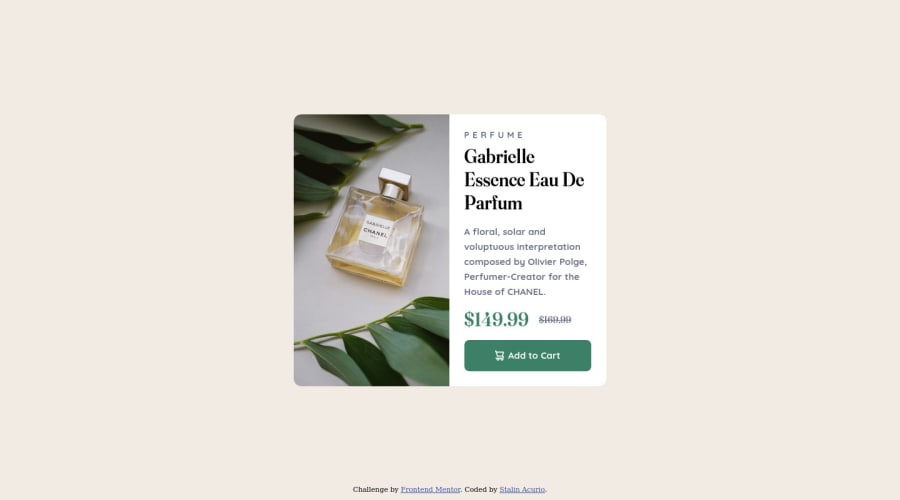
Design comparison
Solution retrospective
Can someone tell me if the html organization is ok or how it could be improved?
Community feedback
- @Enmanuel-Otero-MontanoPosted over 2 years ago
Hello Stalin!
In general your HTML is fine, but I would like to give you a couple of suggestions for improvement.
Try to use semantically meaningful tags (main, section, article, etc) instead of div, I'm not saying don't use div, but only when necessary. What are the benefits of writing semantic HTML? Well, several, more structured and easy-to-read HTML, gives the browser more information about your web page, which gives you a better chance of obtaining better positioning, improves accessibility, among other benefits. What would you change in your code to make it more semantic? Well, the div with the product-container class would change it for a main tag with the same class that the div has, the other thing that would change would be the div with the details class for a section or article tag with the same class.
Finally, when you have to import or call more than one font, do it in a single call, I'm telling you about it because you have two requests and that decreases performance.
Any questions you can ask.
Greetings!
Marked as helpful0@StalinAMPosted over 2 years ago@Enmanuel-Otero-Montano thanks for your comment, I hadn't realized about the fonts and the html structure, I will take it into account for future projects. Thank you very much for your comment.
0 - @elaineleungPosted over 2 years ago
Hi Stalin, this looks good on the whole, so well done, first of all!
About the HTML, I think things look OK here! I might do one or two things differently, but no major issues. For the perfume image, I probably would give it a more descriptive
alttag than just "perfume" (maybe "bottle of perfume with some leaves in the background"?). Also, your classes are clearly named in general (as in, notbox-1); the only thing I'd do differently is, for thedetails, I probably would call itdetails-containeronly because its sibling is called acontainer, and so it'd be easier for me to see that they're related.About the CSS, you really did many things well, the most important of which is, you did not set fixed widths on the selectors and used padding and margins instead for sizing and positioning. The only thing I couldn't figure out at first was why the two containers weren't equal; it didn't make sense when you used
1fr 1frfor the grid columns and you already didn't have any fixed widths. I finally realized what was going on: the problem here is with the grid column values you used inproduct-price. Instead of grid, I'd use flexbox, and I'd wrap the big price inspantags as well so that I can usealign-items: centerto make both prices vertically centered, and then just add a little margin to give them some space. After that, the two image and text containers should be equal in desktop view!Anyway, hope this feedback can help you out a bit, and really great job here once again! 🙂
Marked as helpful0@StalinAMPosted over 2 years ago@elaineleung thank you for your comments, I will take them into account in future projects.
1
Please log in to post a comment
Log in with GitHubJoin our Discord community
Join thousands of Frontend Mentor community members taking the challenges, sharing resources, helping each other, and chatting about all things front-end!
Join our Discord
