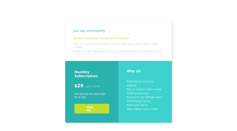
Design comparison
SolutionDesign
Solution retrospective
For this challenge I really wanted to work on the responsiveness of the design and the grid layout. It was a new challenge for me, but I think I'm getting more comfortable with it. Let me know what I could improve on!
Please log in to post a comment
Log in with GitHubCommunity feedback
No feedback yet. Be the first to give feedback on Andrew Grady's solution.
Join our Discord community
Join thousands of Frontend Mentor community members taking the challenges, sharing resources, helping each other, and chatting about all things front-end!
Join our Discord
