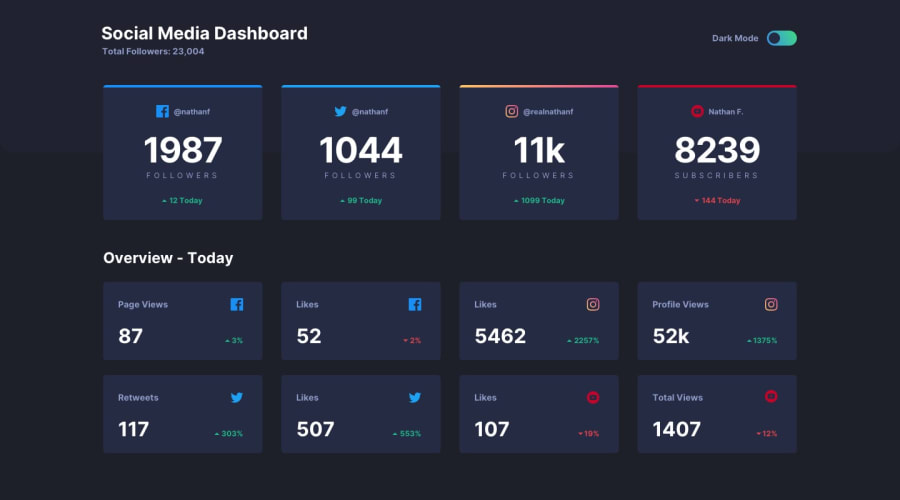
Responsiveness with flex, Animation and JS for toogle
Design comparison
Solution retrospective
What did you find challenging while building the project? Making it mobile responsive actually. I had to clear all my CSS and start all over. I got it in the end. Also making the top background extend into the header section without pushing the whole thing down.
Which areas of your code are you unsure of? The animation and transition. This is my first time of using it. Also the way I used JS to implement the change of theme. Is that the best approach?
Do you have any questions about best practices? Are there any areas I could have done better?
Community feedback
- @Aimal-125Posted over 1 year ago
In your css code when you applied transition to "*" selector, it will apply the transition to all html elements. So, it isn't necessary to apply transition to other elements as it will increase css code. But if you want to apply transition to individual element then apply it to that element only.
Marked as helpful1
Please log in to post a comment
Log in with GitHubJoin our Discord community
Join thousands of Frontend Mentor community members taking the challenges, sharing resources, helping each other, and chatting about all things front-end!
Join our Discord
