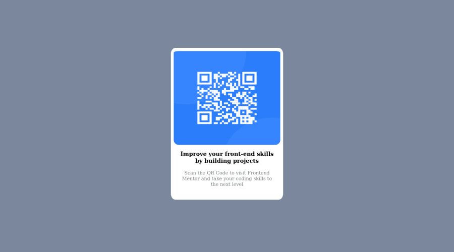
Design comparison
Solution retrospective
I had a tough time battling with responsiveness on different screen sizes, eventually got somewhere but really looking forward to feedbacks on how I could have achieved this faster and easier. Also any other error that needs to be worked on.
Community feedback
- @ecemgoPosted over 1 year ago
Some recommendations regarding your code that could be of interest to you.
If you want that this solution is responsive, I recommend some techniques without using media query for this solution but it's up to you whether you use it or not. Also, I recommend you try to avoid repetition in your code.
HTML
- If you want to use the recommended font-family for this project, you can add the following between the
<head>
tags in HTML file:
<link rel="preconnect" href="https://fonts.googleapis.com"> <link rel="preconnect" href="https://fonts.gstatic.com" crossorigin> <link href="https://fonts.googleapis.com/css2?family=Outfit:wght@400;700&display=swap" rel="stylesheet">
CSS
- After adding them to the HTML, you can add this font-family to the
body
- If you want to make the card centered both horizontally and vertically, you'd better add flexbox and
min-height: 100vh
to thebody
body { /* background-color: hsl(220, 15%, 55%); */ /* padding-top: 10%; */ /* padding-bottom: 10%; */ font-family: "Outfit", sans-serif; background-color: hsl(212, 45%, 89%); display: flex; justify-content: center; align-items: center; min-height: 100vh; }
- When you use flexbox in the
body
, you don't need to usemargin
in the.bg
to center the card - If you use
max-width
, the card will be responsive - You'd better give
padding
to give a gap between the content and the border of the card
.bg { /* margin: auto; */ /* height: auto; */ /* width: 25%; */ max-width: 300px; padding: 20px; }
- In addition to that above, in order to make the card responsive and the image positioned completely on the card, you'd better add
width: 100%
to the img
.img { /* padding-top: 10px; */ /* width: 95%; */ /* height: 60%; */ width: 100%; }
- You don't need to use
margin
for text becausepadding
in the.bg
works. You can remove them to avoid repetition.
p { /* margin-right: 30px; */ /* margin-left: 30px; */ /* padding-bottom: 40px; */ padding-bottom: 20px; }
h3 { /* margin-right: 30px; */ /* margin-left: 30px; */ }
- Finally, if you follow the steps above, the solution will be responsive and you don't need to use media queries for this solution
Hope I am helpful. :)
Marked as helpful1@PopsjrPosted over 1 year agoGot an idea of how to push to github after working on the changes so I won't have to upload the files all over again?.@ecemgo
0@ecemgoPosted over 1 year ago@Popsjr It would be difficult for me to explain how to do it here, but I can suggest you a tutorial about it. Check it out if you want. If you don't have GitHub desktop, download it and start watching from 4:21 because you already have a GitHub account.
After committing the changes on GitHub and you need to deploy it as a live site. Finally, you should click generate a new report on this solution page to clear the warnings. If you want, you can generate a screenshot as well.
Marked as helpful0 - If you want to use the recommended font-family for this project, you can add the following between the
- @0xabdulkhaliqPosted over 1 year ago
Hello there 👋. Congratulations on successfully completing the challenge! 🎉
- I have other recommendations regarding your code that I believe will be of great interest to you.
CSS 🎨:
- Looks like the component has not been centered properly. So let me explain, How you can easily center the component without using
margin
orpadding
.
- We don't need to use
margin
andpadding
to center the component both horizontally & vertically. Because usingmargin
orpadding
will not dynamical centers our component at all states
- To properly center the component in the page, you should use
Flexbox
orGrid
layout. You can read more about centering in CSS here 📚.
- For this demonstration we use css
Grid
to center the component.
body { min-height: 100vh; display: grid; place-items: center; }
- Now remove these styles, after removing you can able to see the changes
@media (max-width: 1000px) { body { padding-top: 500px; padding-bottom: 200px; } } body { padding-top: 10%; padding-bottom: 10%; }
- Now your component has been properly centered
.
I hope you find this helpful 😄 Above all, the solution you submitted is great !
Happy coding!
Marked as helpful1 - @pperdanaPosted over 1 year ago
Hello there 👋. Congratulations on successfully completing the challenge! 🎉
- I have some additional recommendations for your code that I think you'll find interesting and valuable.
📌 Add
<main>
tag as semantic HTML in code-
The
<main>
tag is a semantic HTML element that is used to define the main content of a web page. -
The
<main>
tag should be used to wrap the primary content of a web page, such as the main article, section, or body of text.
for example code:
<main> <div class='container'> <h1>Article Title</h1> <p>Article content goes here...</p> ....................... </div> </main>
In the example above, the
<main>
tag is used to wrap the<div>
tag, which contains the primary content of the web page. This tells both human readers and search engines that the content inside the<main>
tag is the most important and relevant content on the page.I hope you found this helpful!
Happy coding🤖
Marked as helpful0
Please log in to post a comment
Log in with GitHubJoin our Discord community
Join thousands of Frontend Mentor community members taking the challenges, sharing resources, helping each other, and chatting about all things front-end!
Join our Discord