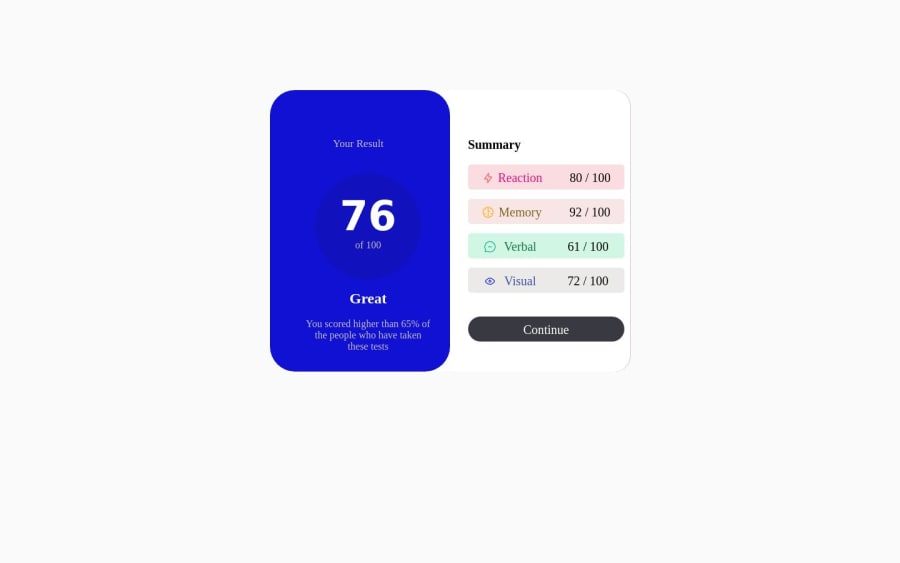
Responsiveness using css display flex and just for desktop view only


Design comparison

Solution retrospective
I find it difficult to overlap different div ,but later solve the problem by using position relative and absolution. Just working on the responsiveness and will soon make it to that stage in a the next challenge. My question is could anyone please refer me to any site or youtube page that could explain Media query perfectly?
Community feedback
- @firebird2552Posted over 1 year ago
When I first load your live site it loads with the titles not inside the boxes. if flip it into mobile mode (which I know you didn't work on) and then back into desktop mode it fixes it. I had a similar issue and ended up using display: grid; on the outer container to fix it. It looks good once the display issue is fixed.
Since your repo exists but is empty I cant look at the code to see if it can be improved at all...
0@Ademolaolas18Posted over 1 year ago@firebird2552 Thanks for the corrections sir. I submitted it late last night so i couldn't upload the code on my github but now you can view it, its now available.
0

Please log in to post a comment
Log in with GitHub
Join our Discord community
Join thousands of Frontend Mentor community members taking the challenges, sharing resources, helping each other, and chatting about all things front-end!
Join our Discord