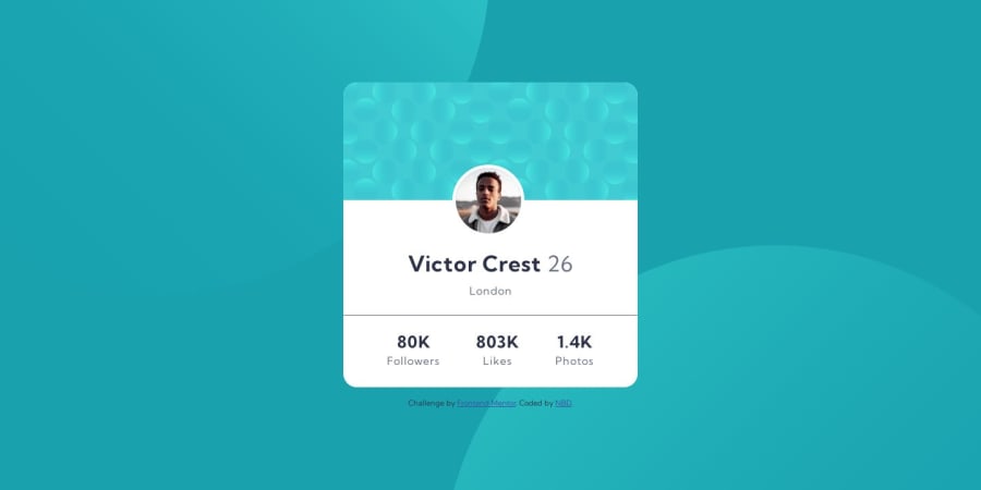
Design comparison
SolutionDesign
Solution retrospective
Hey All,
Again a new challenge with a tricky background, but eventually I guess I nailed it (was easier than I had imagined)... Again playing around with rem instead of pixels and no set height, no set width, only max and min. Any feedback is welcome.
Cheers,
Dalma
Please log in to post a comment
Log in with GitHubCommunity feedback
No feedback yet. Be the first to give feedback on NBD's solution.
Join our Discord community
Join thousands of Frontend Mentor community members taking the challenges, sharing resources, helping each other, and chatting about all things front-end!
Join our Discord
