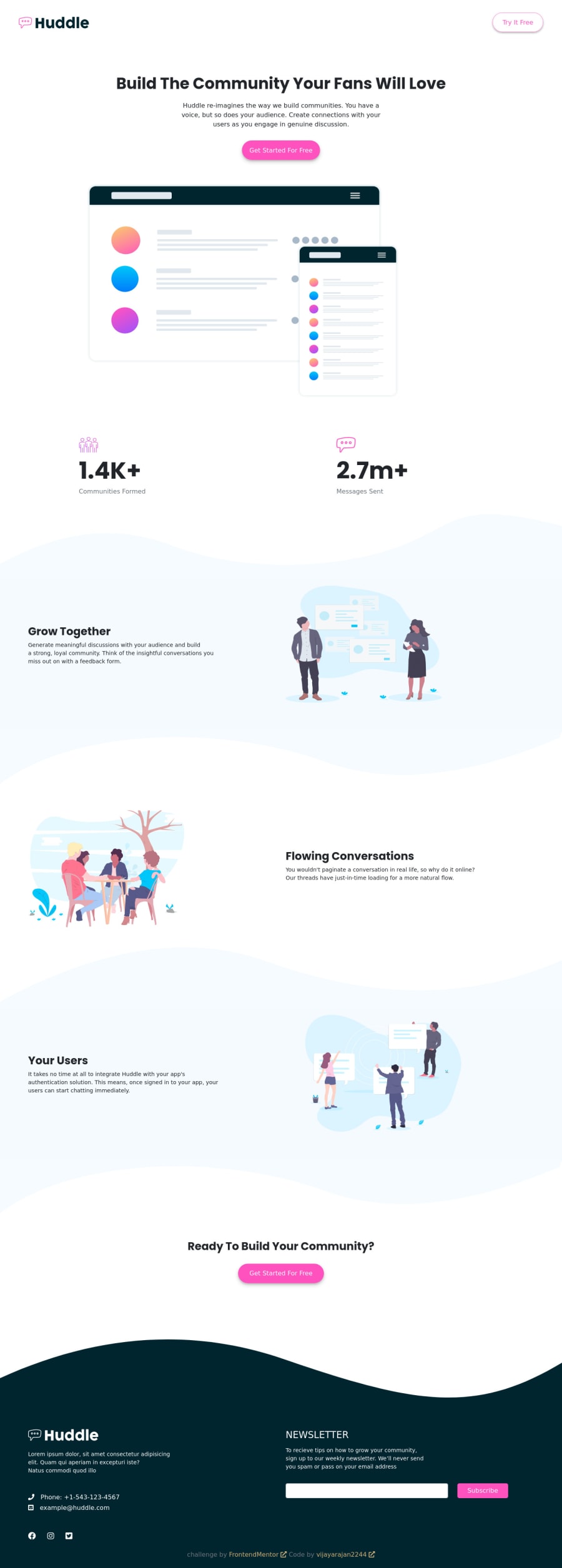
Fully-Responsive-Huddle-Landing-Curved-Section-Master
Design comparison
Community feedback
- @AbNassifPosted over 3 years ago
Your culprit for the horizontal overflow is the button in the Navigation bar that contains the text "Try it for free". A cute way of solving it would be to add an (overflow-x:hidden") to the parent and forget it exists. But in all seriousness, figure out what class in the desktop viewport caused the button to have all these margins in the mobile view.
Other than that, It looks super good. Great job!
Marked as helpful1@vijayarajan2244Posted over 3 years ago@AbNassif Thank you so much.
It is worked, thanks a lot...
1@vijayarajan2244Posted over 3 years ago@AbNassif
This is also same problem, White space on right side. You know solution?
I give below link: https://www.frontendmentor.io/solutions/clipboardlandingpagesmmdlgxl-1TtkSWDES
1
Please log in to post a comment
Log in with GitHubJoin our Discord community
Join thousands of Frontend Mentor community members taking the challenges, sharing resources, helping each other, and chatting about all things front-end!
Join our Discord
