Responsive-Bootcamp-Testimonial-Slider-Made -With-GRID-FLEXBOX-and-JS
Design comparison
Solution retrospective
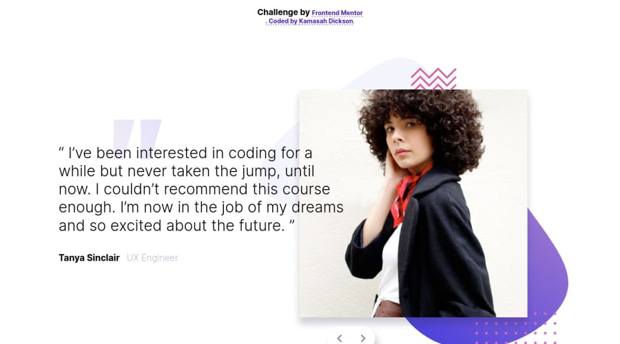
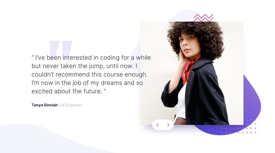
Hello FrontendMentors. I made a solution for the bootcamp testimonial slider. I wanted to add an @keyframe class to the slider when the button is toggled but it seems the transition only happens once when I toggle the button. Well what do you think about my solution. I really need your opinions on this and please do not forget to like and comment. have a nice day :)
Community feedback
- @Sdann26Posted over 2 years ago
Hello Kamasah!
I hope you can understand my comment as the button depending on how big the screen is can move out of the image.
Personally I would create a parent div that has inside the image and the button, this div with
positivon: relative(This div would occupy the same size as your image). And with that I would position the button withposition: absoluteandz-index: 1. And there I would begin to position it, since the button is currently positioned with respect to the<div class="right-img">and depending on the screen the button would move lower or higher (I'm talking about the desktop view).If you manage to achieve that it will look good for all screen types.
By the way the text and the user name have the following color if I am not mistaken
hsl(240, 38%, 20%)and the sentences have a thinner font-weight for examplefont-weight: 200.And nothing you already know how to fix the errors in the report, the rest seems fine to me.
1@Kamasah-DicksonPosted over 2 years ago@Sdann26 I am glad to hear from you, I was updating the accessibility issues and took me much longer because of my internet connection. I have now updated my solution, any opinions again.
0
Please log in to post a comment
Log in with GitHubJoin our Discord community
Join thousands of Frontend Mentor community members taking the challenges, sharing resources, helping each other, and chatting about all things front-end!
Join our Discord
