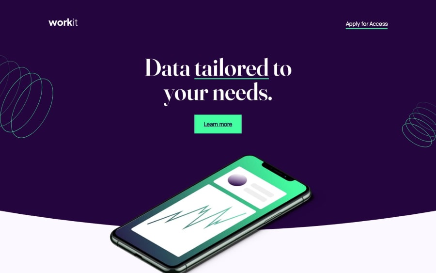
Design comparison
SolutionDesign
Community feedback
- @ChamuMutezvaPosted about 1 year ago
Greetings NataJenkins.
Having gone through your solution, here are some few considerations that you can consider:
- it is a good thing that all your images have
altvalues as recommended but take note that some images are merely for decoration and should have an empty alt value as inalt = "". Some words such aslogo, image, pictureshould be avoided in the alt description as they are automatically announced by assistive technology. Including them will cause a repetition in the announcement. The message in the alt value is meant to provide a decrypted message in the image. - the logo should have an anchor element as its parent, that represents a link to the home page in a site.
Apply for AccessandLearn more, in my opinions should be links to another section or page or section and should therefore be represented with an anchor element. I would suggest to look at when and where to use a button and anchor element . In short an anchor element is associated when navigating to other section or pages and a button is meant for submitting a form or event handlersinformation-container__element-description, this content should be a paragraph. A div is a general element with no semantic meaning and should only be used as the last choice.- some of your styles are heavily nested ,
.container .header .title button. Keep specificity as low as possibly by applying styles on classes. Heavily nested styles are difficulty to maintain , debug and override. In this case the button should have a class that you should target. Nesting should be done when adding pseudo (hover, focus etc) - the site breaks between 376px and about 600px.
Marked as helpful0 - it is a good thing that all your images have
Please log in to post a comment
Log in with GitHubJoin our Discord community
Join thousands of Frontend Mentor community members taking the challenges, sharing resources, helping each other, and chatting about all things front-end!
Join our Discord
