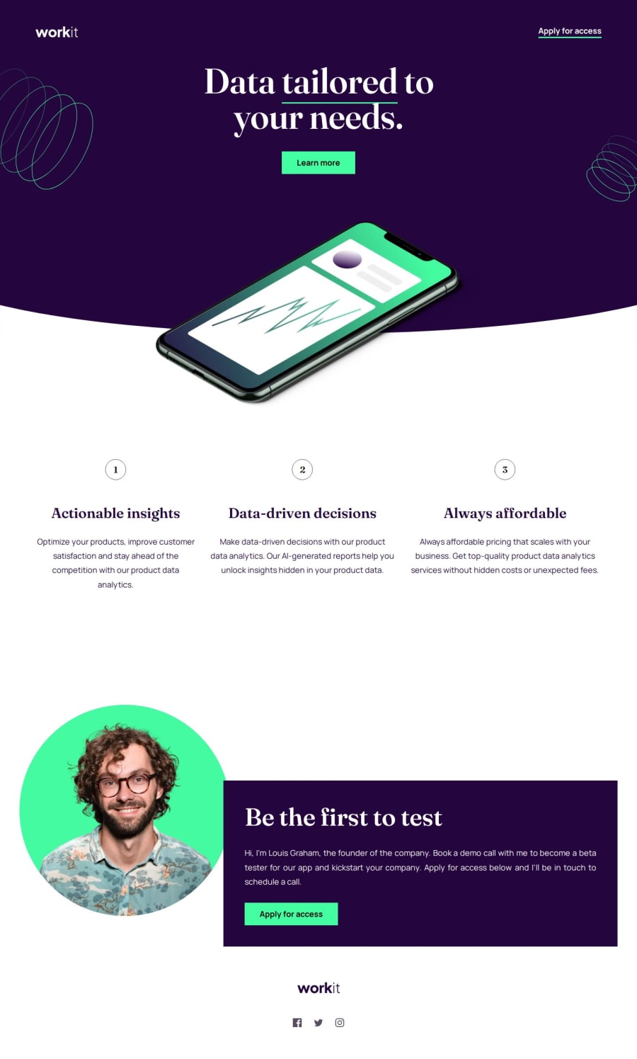
Responsive Workit Landing Page using SASS and BEM


Design comparison

Solution retrospective
Any improvements or suggestions will be appreciated!
Community feedback
- P@lynx232Posted 3 months ago
Does the solution include semantic HTML?
- Yes it does!
Is it accessible, and what improvements could be made?
- It is! Few suggestions:
- I think it is better to use font @font-face instead of @import when fonts are provided in the zip file. That is because you when using @font-face you no longer have to adhere to a particular set of "web safe" fonts that the user has pre-installed on their computer;
- Use a predefined modern reset, it makes your job easier. I prefer A Modern CSS Reset - Josh W Comeau;
Does the layout look good on a range of screen sizes?
- It does. Here are a few more suggestions:
- Define the width for the hero__title element so that it will continue to look good even on widescreen displays;
- Define the size for the hero__title element for 320px wide displays so that it will look better;
- Define the position of the hero__image element depending on the screen sizes;
- Define the width and height of div.founder, so that it will look good on all displays;
Is the code well-structured, readable, and reusable?
- Yes.
Does the solution differ considerably from the design?
- It doesn't. Only thing noticeable is that the bullets points should be nested in an element that has a light purple background color.
I want to end this by telling you that you did a great job on your project, and I wish you good luck further down this path. Lastly, I would like to ask to review as many solutions on this website as possible, so that we could all continue to improve, and that you will ask the same of others.
Once again, best of luck on your journey! 🍻
0

Please log in to post a comment
Log in with GitHub
Join our Discord community
Join thousands of Frontend Mentor community members taking the challenges, sharing resources, helping each other, and chatting about all things front-end!
Join our Discord