Workit Landing Page (SCSS)


Design comparison

Solution retrospective
I feel more and more confident thanks to the responsive layout, although I still have a lot to learn.
I would try to find out better approach to put and control images on my page. I am still confused how is works sometimes.
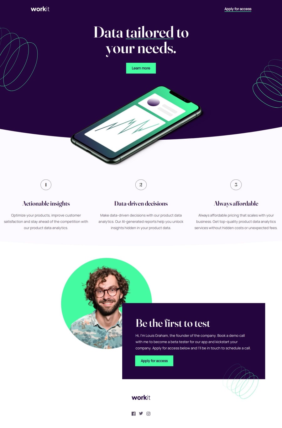
My solution combines pseudo elements and background images. I don't know if it is good approach because you can get lost with z-indexes.
What challenges did you encounter, and how did you overcome them?I used a lot of clamp() to make my site responsive but it still a little bit weird for me how it works.
What specific areas of your project would you like help with?I would like to know what is your approach to curved borders. My solution doesn't look perfect.
How do you overcome with margin and padding in responsive layouts? What should I use to let them smooth growing. I tried with %, em unit and clamp() functions.
Community feedback
Please log in to post a comment
Log in with GitHubJoin our Discord community
Join thousands of Frontend Mentor community members taking the challenges, sharing resources, helping each other, and chatting about all things front-end!
Join our Discord