Design comparison
SolutionDesign
Solution retrospective
What are you most proud of, and what would you do differently next time?
¯_(ツ)_/¯
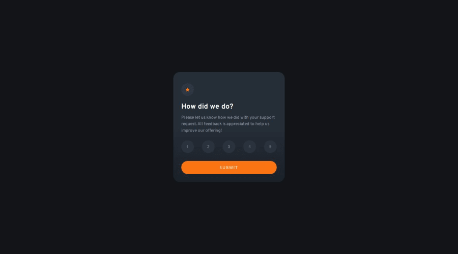
What challenges did you encounter, and how did you overcome them?The background/color seems off, I didn't overcome it Lol. Can't find the right color even with the style-guide. (╯°□°)╯︵ ┻━┻
What specific areas of your project would you like help with?Colors. Probably.
My JavaScript code too, maybe there's an efficient way to do it other than my solution. I'm a little confident with CSS but hey, maybe I'm doing something wrong? The way I use HTML semantics too.
Any opinion helps, thanks~
Here's my advance payment -- (☞゚ヮ゚)☞ ❤
Community feedback
Please log in to post a comment
Log in with GitHubJoin our Discord community
Join thousands of Frontend Mentor community members taking the challenges, sharing resources, helping each other, and chatting about all things front-end!
Join our Discord
