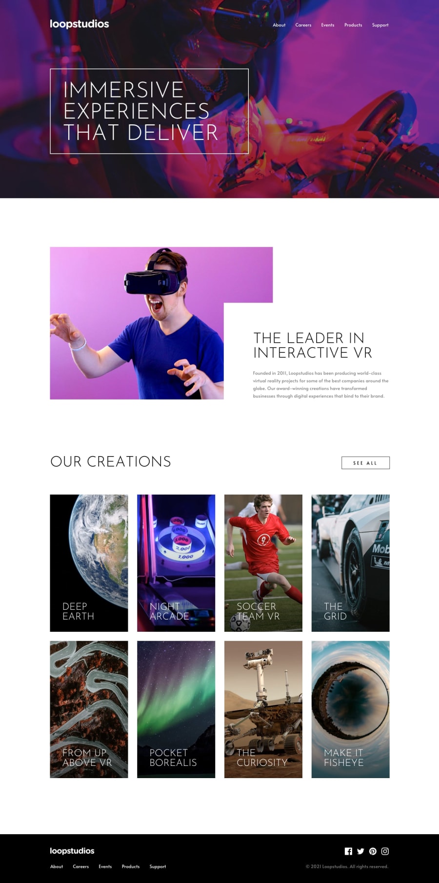
Design comparison
SolutionDesign
Solution retrospective
feedback welcome!!t
Community feedback
- @Vincent-BoutonPosted 9 months ago
Hello Abhishek! 👋
Good Job finishing the challenge!
Small improvements 🧐
-
Some text are hard to read on the Hero banner, maybe using a filter to have a darker background might help
-
Same for the cards in Our Creations Section. Maybe there simply make a gradient from the bottom to the top. Like in the design.
-
Some indications when we hover elements might be cool!
You did very good! Keep the good work! 👌
Marked as helpful0 -
Please log in to post a comment
Log in with GitHubJoin our Discord community
Join thousands of Frontend Mentor community members taking the challenges, sharing resources, helping each other, and chatting about all things front-end!
Join our Discord
