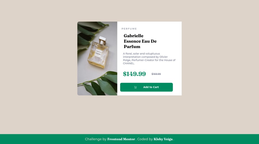
Design comparison
Solution retrospective
yes, with responsive.
Community feedback
- @correlucasPosted about 2 years ago
👾Hello @Kleby, Congratulations on completing this challenge!
Your solution its almost done and I’ve some tips to help you to improve it:
Using
<picture>you’ve more control over the elements and its better than using the product image as<img>orbackground-image. Look that for SEO and search engine reasons it isn't a better practice to import this product image with CSS since this will make it harder to the image. You can manage both images inside the<picture>tag and use the html to code to set when the images should change setting the devicemax-widthdepending of the device (phone / computer) Here’s a guide about how to usepicture:https://www.w3schools.com/tags/tag_picture.asp2.Add
justify-content: center;to make the container vertically centedbody { display: flex; flex-direction: column; align-items: center; justify-content: center; height: 100vh; font-size: 14px; font-family: "Montserrat", sans-serif; background-color: #ddd3c8; }✌️ I hope this helps you and happy coding!
Marked as helpful0
Please log in to post a comment
Log in with GitHubJoin our Discord community
Join thousands of Frontend Mentor community members taking the challenges, sharing resources, helping each other, and chatting about all things front-end!
Join our Discord
