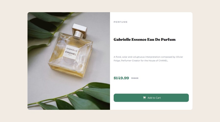
Design comparison
SolutionDesign
Solution retrospective
What are you most proud of, and what would you do differently next time?
I just want to take a part in frontend mentor challenges.
What challenges did you encounter, and how did you overcome them?how to position card background image was challenging for me. I read mozilla developer network blog.
What specific areas of your project would you like help with?any suggestion are welcome
Community feedback
Please log in to post a comment
Log in with GitHubJoin our Discord community
Join thousands of Frontend Mentor community members taking the challenges, sharing resources, helping each other, and chatting about all things front-end!
Join our Discord
