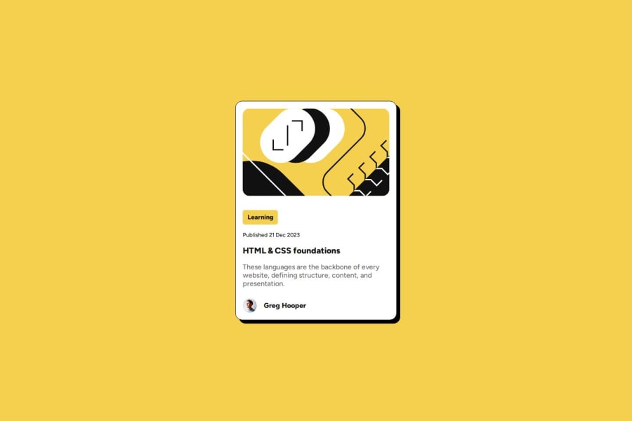
Design comparison
SolutionDesign
Solution retrospective
What are you most proud of, and what would you do differently next time?
Nice project all around. HTML was done pretty quick and I am getting familiar with FlexBox. CSS still took most of the time. I tried using % for responsiveness but it messed up my layout on desktop. I guess it was not the goal of this challenge
What challenges did you encounter, and how did you overcome them?Still having some little issues with FlexBox align-items and justify-content with row and column display.
What specific areas of your project would you like help with?I feel like I called out 'display:flex;' too many times. Can you have a look ?
Join our Discord community
Join thousands of Frontend Mentor community members taking the challenges, sharing resources, helping each other, and chatting about all things front-end!
Join our Discord
