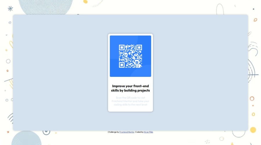
Responsive Website with a qr code component
Design comparison
Solution retrospective
I am proud of the fact that I was able to apply all the css skills that i learnt without having to revise everything or having to refer multiple times. But obviously there were instances where I had to refer to ai tools like chatgpt when my code was getting broken to speed up my efficiency. I could reduce the overall number of divs in the tag because i think it is overloaded with multiple divs.
What challenges did you encounter, and how did you overcome them?One of the most weird challenges that i encountered was the qr-component not resizing properly due to container-box constraints of height. Then I worked on it by adding some padding and applying aspect ratios to some components
What specific areas of your project would you like help with?I dont think I need help yet, but if there is something that i would need some referrals upon would be the number of divs and sections i should use to mimic the result.
Community feedback
Please log in to post a comment
Log in with GitHubJoin our Discord community
Join thousands of Frontend Mentor community members taking the challenges, sharing resources, helping each other, and chatting about all things front-end!
Join our Discord
