Submitted about 3 years ago
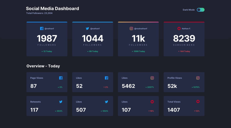
Responsive website using Sass flex grdis and javascript mobile first
@CostiVoicu
Design comparison
SolutionDesign
Solution retrospective
Any feedback is welcomed!
Community feedback
- Account deleted
Hi,
On desktop I think your solution looks pretty good;
-
I think you should have another layout between the mobile and desktop because the moment it switches to mobile the cards are just too stretched out.
-
You should put
cursor : pointeron the toggle to indicate that it's clickable when you hovering over it.
Marked as helpful1 -
Please log in to post a comment
Log in with GitHubJoin our Discord community
Join thousands of Frontend Mentor community members taking the challenges, sharing resources, helping each other, and chatting about all things front-end!
Join our Discord
