Not Found
Not Found
Not Found
Not Found
Not Found
Not Found
Not Found
Not Found
Not Found
Not Found
Not Found
Not Found
Not Found
Not Found
Not Found
Not Found
Not Found
Not Found
Not Found
Not Found

Submitted

Responsive Website - using html, css and some bootstrap only

@PishoTo

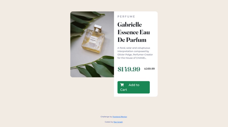
Desktop design screenshot for the Product preview card component coding challenge

This is a solution for...

  • HTML
  • CSS
1newbie
View challenge

Design comparison


SolutionDesign

Solution retrospective


I have a lot of trouble making the website responsive. I have created another website while following the instructions of the course instructor, and it was a lot easier than doing things myself.

Eventually, the website I was able to build (and I took the simplest challenge here) is not really responsive...

Would love to have some comments or ideas how to improve the way I code to make this website (and my next ones) responsive without spending hours on it :)

Thanks!

Community feedback

Elaine 11,400

@elaineleung

Posted

Hi Raz, well done completing your first project by yourself, and welcome to Frontend Mentor! I'll try to give you some ideas here on responsiveness that might help you.

  1. First off, I can only see your desktop image and not the mobile version. While there are many ways to switch between views, one easy way is to use the img tag with srcset. This allows you to put more than one image inside the img with their widths in w; you'll have to look up the widths of the images you use, but here I've provided the ones in this challenge for you. In this way, the browser can choose which one to use at the breakpoint you specify:

    <img alt="perfume bottle" 
        srcset="images/image-product-desktop.jpg 600w, images/image- product-mobile.jpg 686w"        
        sizes="(min-width: 995px) 600px, 686px" 
        src="images/image-product-mobile.jpg">
    

    You'd also want to add object-fit:cover to your image and give it a height:100% at desktop view so that it can stretch and match the text container.

  2. Instead of using percentages for padding, try to use rem units, where 1rem is 16px. It's really just a lot easier this way (at least for me when I started using rem units), and you'd find that a lot of the padding and margins are a full round rem (e.g., 1rem, 2rem). For instance, instead of the padding: 5% 18%; in the product container, I'd use padding: 2rem instead to give the container a 2rem padding all around.

  3. I can see that something funny is happening below the 600px breakpoint. The reason for that is you're using flex-wrap with flex-direction: row (which is a default when you add display:flex even when you don't specify the flex direction), and instead of having 1 column, the text just "wraps" over to have a row of 2 columns. What I'd do is, in the product container, I'd add flex-direction: column and give it a max-width: 450px with margin-inline: auto to keep things centered. Then at your breakpoint, in the media query I'd change the flex-direction to row and change max-width to 600px in the product container; at that point the columns might be even since I see you got flex on them already. For more on responsive properties, check out this article on web.dev.

I think that's all in terms of suggestions because this was a bit tough to troubleshoot due to all the Bootstrap classes. If you're kind of starting out, I actually suggest not using any systems (e.g., Bootstrap, Tailwind); I think you'd benefit a lot from just writing pure CSS so that you understand what each line is doing first, and I suggest experimenting a lot with this. One thing I like doing for these small components is, I would bring the code over to CodePen and just try out different things. It really helps to get the fundamentals right before bringing in a system.

Hope some of this can help you out!

Marked as helpful

0

@PishoTo

Posted

@elaineleung thank you so much! Super helpful! I really really appreciate the feedback!!!

So, I have just completed another challenge, where I also used Bootstrap, and on the other one things went a lot better, since I found the possibility to change the "flex" property in the media query (this resolved the responsiveness in the other project).

To your comments: I am surely going to try without Bootstrap as well, and the evidence is that most of the concepts you were talking about here are new to me and I don't know most of them :) So thanks for both the honest feedback as well as for the suggestions how to proceed from here.

Have a great day! Raz

0

Please log in to post a comment

Log in with GitHub
Discord logo

Join our Discord community

Join thousands of Frontend Mentor community members taking the challenges, sharing resources, helping each other, and chatting about all things front-end!

Join our Discord