Not Found
Not Found
Not Found
Not Found
Not Found
Not Found
Not Found
Not Found
Not Found
Not Found
Not Found
Not Found
Not Found
Not Found
Not Found
Not Found
Not Found
Not Found
Not Found
Not Found

Submitted

Responsive website using html and css

simplykoon 130

@simplykoon

Desktop design screenshot for the Product preview card component coding challenge

This is a solution for...

  • HTML
  • CSS
1newbie
View challenge

Design comparison


SolutionDesign

Solution retrospective


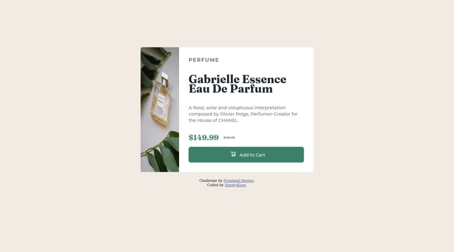
I had a few challenges during this project. I was able to find some answers online and others by moving around a few things. I wasn't able to make the cart icon and the "add to cart" text align properly though. I don't know why. It just doesn't listen!

Community feedback

@VCarames

Posted

Hey @simplykoon, some suggestions to improve you code:

  • The Alt Tag Description for the image needs to be improved upon. You want to describe what the image is; they need to be readable. Assume you’re describing the image to someone.

  • This challenges requires the use of two images 🎑 for different breakpoints. The Picture Element will facilitate this.

Here is an example of how it works: EXAMPLE

Syntax:

  <picture>
    <source media="(min-width: )" srcset="">
    <img src="" alt="">
  </picture>

More Info:

https://www.w3schools.com/html/html_images_picture.asp

https://web.dev/learn/design/picture-element/

  • The name of the perfume , “Gabrielle Essence Eau De Parfum” is the most important content in your card so it should be wrapped in a Heading Element.

  • Your button needs to have a cursor: pointer.

Happy Coding! 👻🎃

Marked as helpful

1

simplykoon 130

@simplykoon

Posted

@vcarames Thank you so much for the tips. I'll work in it🤗🤗🤗

0

@zp021

Posted

Hi! What I did for the button was align-items: center; and justify-content: center; Also for the images you can use <picture> tag to handle the change of images from mobile to desktop view:

<picture><source media="(min-width: 640px)" srcset="./images/image-product-desktop.jpg"><img src="./images/image-product-mobile.jpg" alt="image-mobile"></picture>

Keep it up and happy coding!

Marked as helpful

1

simplykoon 130

@simplykoon

Posted

@zp021 I also saw this when I searched for best ways to include different pictures for different screen sizes. I wasn't sure about what the min-width should be so I decided against it. I'll definitely try this though. Thank you for taking the time🥺🥺

0

Please log in to post a comment

Log in with GitHub
Discord logo

Join our Discord community

Join thousands of Frontend Mentor community members taking the challenges, sharing resources, helping each other, and chatting about all things front-end!

Join our Discord