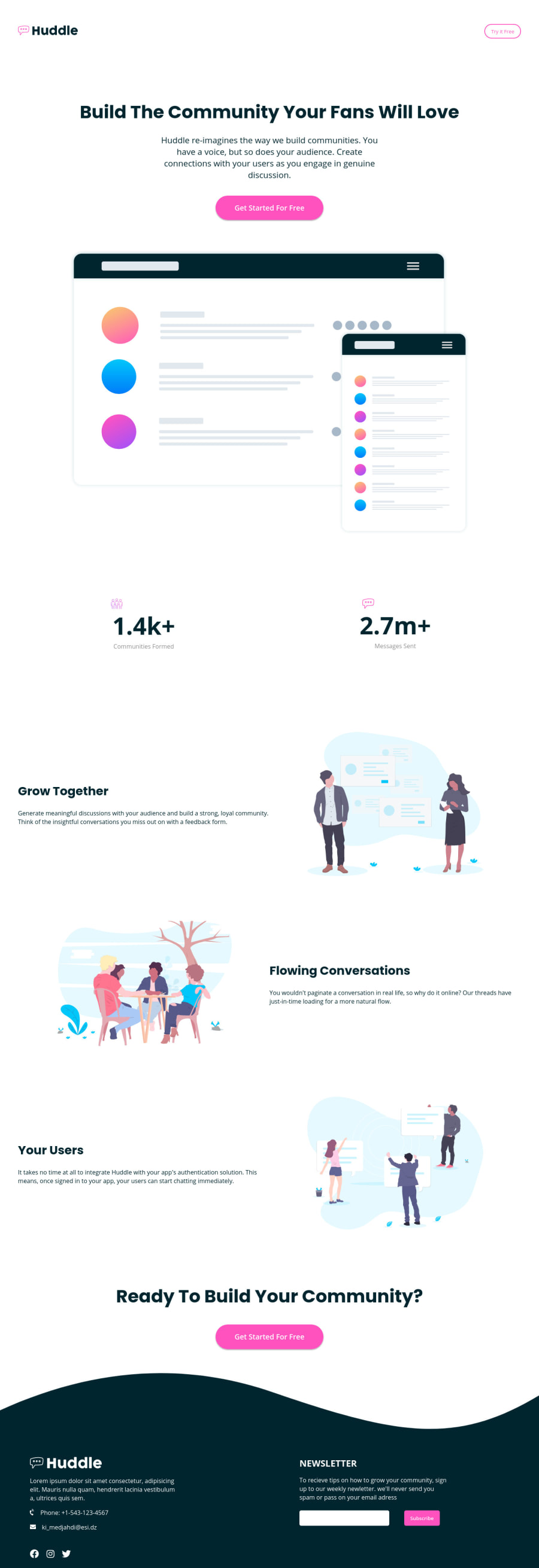
Design comparison
Solution retrospective
this my first complete landing page , What do u think ? should I start learning JS ???
Community feedback
- @pikapikamartPosted about 3 years ago
Hey, awesome work on this one. Layout in desktop seems fine, though it is much shorted than the original, some elements as well are missing like the background-wave-images. The mobile layout seems fine as well I think but I don't know if the text are supposed to have those huge gap between them.
Well you can learn js, but do not be derailed like going through the data structures and algorithm right now, you can learn those later but for now, go with just basic, with dom manipulations. Learning algo-ds right now will just confuse you to where to use them, dom manipulations should be first because you will very much use them.
Some other suggestions would be:
- The huddle-website-logo-link, the
img
should havealt="huddle"
on it, since the logo itself have the text, better use it as thealt
value when it is animg
. - The
a
tag as well that holds the logo-link should havearia-label="homepage"
. Thisaria-label
is an attribute that is used to an element who doesn't have any text inside it that could describe what is the element is all about. Since as you can see, thea
tag have animg
inside it, but there is no text, so when you usearia-label
on thea
tag, the value of that attribute serves as the text for it. You will use a lot of this ona
tags especially when the content inside it have no text. The reason that it should bearia-label="homepage"
is because, typically the website link points the user to the homepage right, this way, users will know that this link will lead them to the homepage. - Do not remove the
outline
property on elements,outline
serves as a visual indicator for users, for example, try using thetab
keys in your keyboard, you should navigate thebutton
ora
tags with it, but since theoutline: none
is present, there is no indication to where you are at right now. If you removed it, better use some visual in the:focus-visible
state of the element in the css. - I think those
try for free
andget started for free
will be much great if they werea
tags, since right now, it doesn't look like those are supposed modals of some sort, wherebutton
are much use.
FOOTER
- The website logo
img
should also usealt="huddle"
on it. - The social media links should be inside a
ul
element, since those are list of social media links. - Each
a
tag that wraps the social media icon should havearia-label
since it doesn't contain any text. For the facebook, it should be likearia-label="facebook"
. - The
input
along with thebutton
should be inside aform
element, since that will server as aform
to be submitted. - The
input
as well should havelabel
element on it, so that there will be a text that will be read when the user navigated on it, or instead, you could usearia-label
on it, likearia-label="enter your email"
, this way, users will know what to input.
Aside from those, great work.
Marked as helpful1@IslemMedjahdiPosted about 3 years ago@pikamart
- These tips are really helpful. Thank you so much!
- In terms of algorithms, I'm actually an undergraduate computer science student so I'm good at algorithms as well as data structures like trees & linked list... , From your comment I learned many things like the aria-label and the relationship between tab and the outline.
- I will do more HTML/CSS mini challenges then I will start learning JavaScript.
1 - The huddle-website-logo-link, the
- @vikrantmallaPosted about 3 years ago
Add background in div three and seven. Learning JS makes it easier to develop a website but now HTML/CSS worked fine.
1@IslemMedjahdiPosted about 3 years ago@vikrantmalla Thank you so much for your reply ❤
0
Please log in to post a comment
Log in with GitHubJoin our Discord community
Join thousands of Frontend Mentor community members taking the challenges, sharing resources, helping each other, and chatting about all things front-end!
Join our Discord