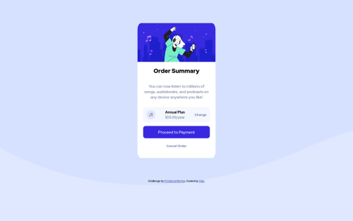
Submitted about 4 years agoA solution to the Order summary component challenge
Responsive website using Flexbox
@halamh

Solution retrospective
How can I make the text "Annual Plan" and the price below it closer to the music icon instead of being in the middle?
Code
Loading...
Please log in to post a comment
Log in with GitHubCommunity feedback
No feedback yet. Be the first to give feedback on Hala's solution.
Join our Discord community
Join thousands of Frontend Mentor community members taking the challenges, sharing resources, helping each other, and chatting about all things front-end!
Join our Discord