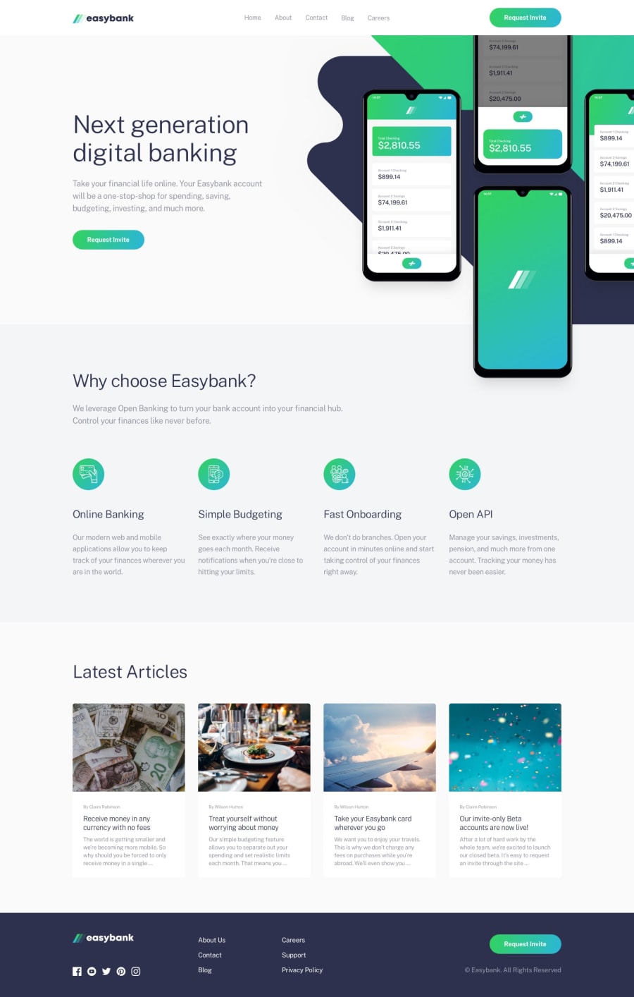
Responsive website landing page using sass
Design comparison
Solution retrospective
I wish if someone can tell me if I may need more organization or optimization skills. I already know how to make the website but I guess the idea is how clean, organized and optimized is your work that's what put you on the top of the shelf.
Community feedback
- @benjoquilarioPosted about 3 years ago
Hello!👋 @menoo20
Great job on finishing this one. It looks good and response very well.
-
It seems the only need to change is the
<img> tagbecause It needs and alternative text when user having a internet problem. -
To make organize you file clean and organize you must learn how to use the
7-1 sass architecture. Here's the link
Good luck and keep coding!
Marked as helpful0@menoo20Posted about 3 years ago@benjoquilario Yes, you are right. I should put the alternate text for the images. I although looked at the sass article and I am really inspired by the way the 7-1 sass is organizing the style. I am currently learning that and I guess I will follow that approach in the next project I do. Thanks for your support and I hope you all the good bro.
0 -
Please log in to post a comment
Log in with GitHubJoin our Discord community
Join thousands of Frontend Mentor community members taking the challenges, sharing resources, helping each other, and chatting about all things front-end!
Join our Discord
