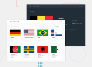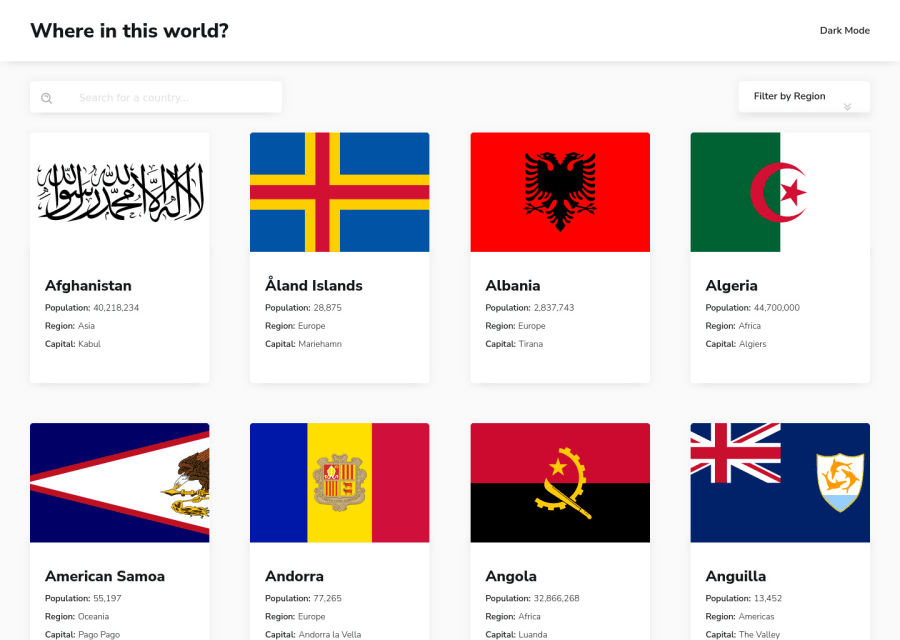
responsive webpage with Flexbox, MVC architecture, ES6, PARCEL, MODULE
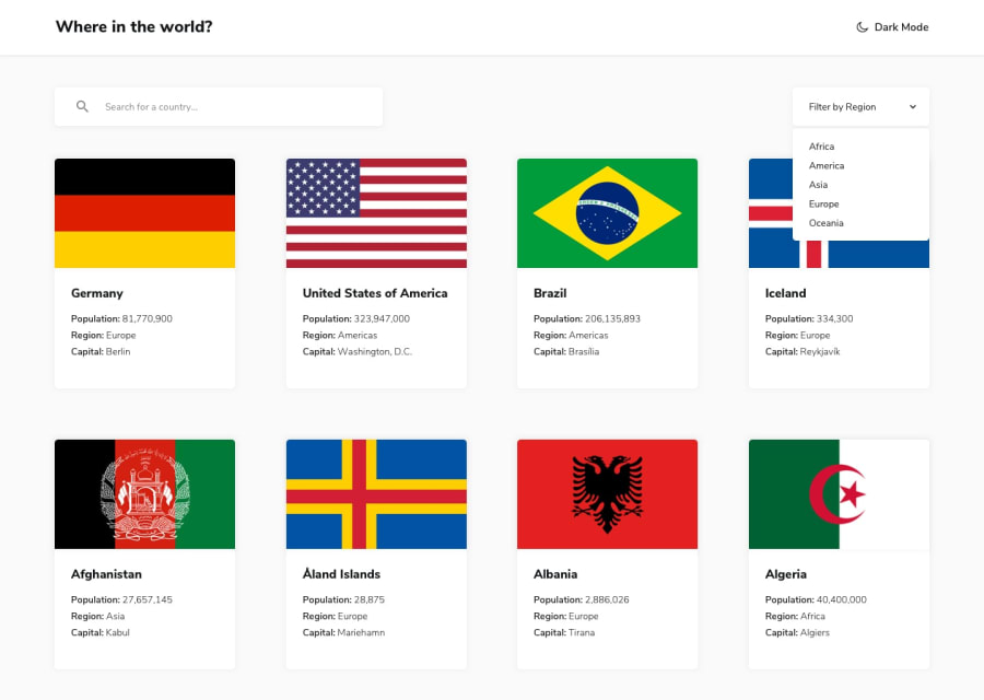
Design comparison
Solution retrospective
Hey folks!, "I've worked hard & with love on this project and would appreciate your feedback. What do you like about it, and what do you think could be improved?" Thank You :)
Community feedback
- @FexxixPosted over 1 year ago
It's good and it's nice you didn't get any accessibility errors but I think that I will point out a few things:
- I, as a user, would prefer if the theme switcher, select, and search icons didn't animate indefinitely.
- I think you forgot to change the input font color based on theme.
- The text shadow in the details page is kinda uncomfortable and I personally don't like it.
- When viewing details in succession (clicking through borders), the back button doesn't move backward by 1 so you might wanna look into that. (This might be the intended behaviour so I am sorry in case it is).
Marked as helpful0 - @coderdanniePosted over 1 year ago
Hi. Congrats on the completion of this project. An extra features you can add is to store the themes state using browser localstorage so that your site can maintain the theme state even if the page was reload. Right now if I switch to light mode and reload the web page its switching back to the default theme. Using browser storage to store the theme and accessing the themes based on user preference will prevent this from happening. https://developer.mozilla.org/en-US/docs/Web/API/Window/localStorage
1
Please log in to post a comment
Log in with GitHubJoin our Discord community
Join thousands of Frontend Mentor community members taking the challenges, sharing resources, helping each other, and chatting about all things front-end!
Join our Discord