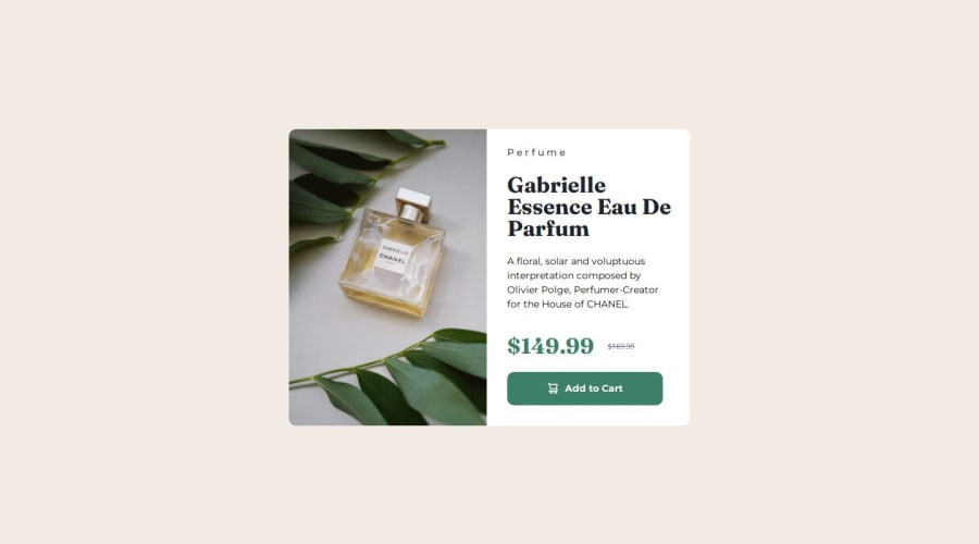
Design comparison
Solution retrospective
got started with css grid, learn more about css grid
What challenges did you encounter, and how did you overcome them?image sizing was a pain , had to specify size into pixels also height on cart icon was missing so i asked someone what was wrong with it
What specific areas of your project would you like help with?maybe more knowledge on css grids like what i could've do better on this one
Community feedback
- @R3ygoskiPosted 7 months ago
Hello @PastaSus, your project is looking very good, and I don't see a need to change the way you're using the grid; it's absolutely correct.
But if you're still interested in learning about other ways to use the grid, you can look into
grid-area
. This way, you can create layouts much faster and more efficiently.Another tip, regarding your CSS this time, when using font sizes, try to avoid using the unit px. Instead, use rem because this unit adapts to users' font size settings, making your font more responsive and accessible.
And another tip, this time focusing on HTML semantics: try to make your code as semantic as possible, as it helps with the accessibility of your project. For example, this snippet:
<div class="contentcontainer">
would make more sense as a<main>
, tag, because it contains all the main content.Once again, congratulations! Your project looks really nice. Keep up the good work, and if anything I said isn't clear, please comment below.
0
Please log in to post a comment
Log in with GitHubJoin our Discord community
Join thousands of Frontend Mentor community members taking the challenges, sharing resources, helping each other, and chatting about all things front-end!
Join our Discord