Design comparison
SolutionDesign
Community feedback
- @nrdygrnmaPosted 5 months ago
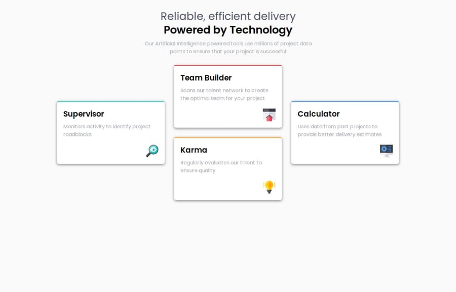
Your solution looks nice! A few observations from my side, if you allow me :)
- The color of the titles look a bit dark - maybe a slightly lighter color, such as the smokey gray provided in the Figma file would look even better.
- The box shadows could be a bit less dominating by using a lighter color (or use more opacity).
Marked as helpful0
Please log in to post a comment
Log in with GitHubJoin our Discord community
Join thousands of Frontend Mentor community members taking the challenges, sharing resources, helping each other, and chatting about all things front-end!
Join our Discord
