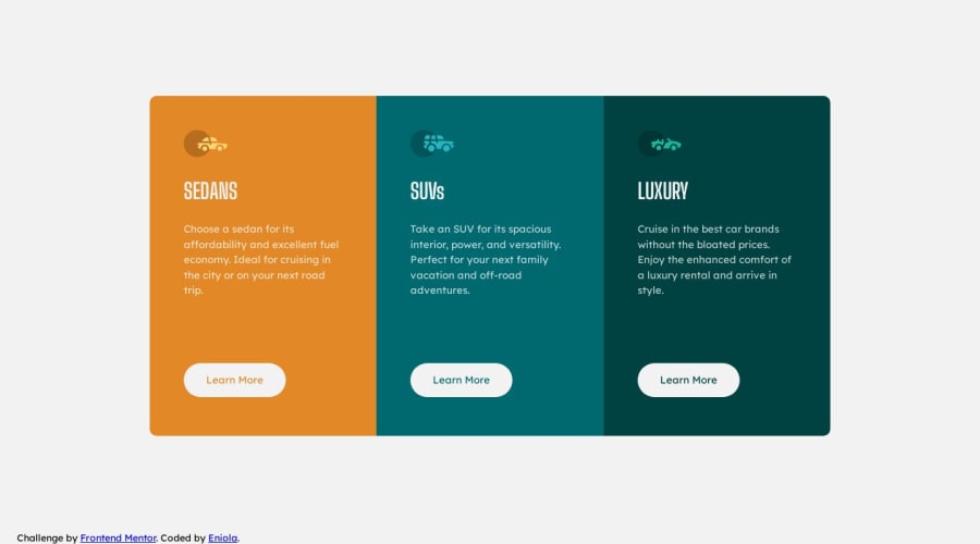
Design comparison
Community feedback
- @Islandstone89Posted 11 months ago
HTML:
-
You need a
<main>, this is important for accessibility. Change.main-containerto a<main>. -
The icons are decorative, so the alt text should be empty:
alt="". -
The headings should be written with normal capitalization. You then use
text-transform: uppercaseto change the capitalization in CSS. -
"Learn More" would navigate to another page, hence it is not a button but a link.
-
Footer text needs to be wrapped in a
<p>.
CSS:
-
It's good practice to include a CSS Reset at the top.
-
bodyshould havemin-heightinstead ofheight. Also, addjustify-content: centerandalign-items: centerto center the card container in the middle. -
Remove
flex: 1on.main-container. -
font-sizemust never be in px. This is bad for accessibility, as it prevents the font size from scaling with the user's default setting in the browser. Use rem instead. -
Remove all fixed widths and heights. You rarely want to set fixed dimensions (especially heights!), as this easily creates issues with responsiveness.
-
If needed, add a
max-widthin rem on the card container, so it doesn't stretch too wide on big screens. -
"Learn More" should not have
position: absolute. -
Media Queries should be in rem instead of px. You don't want any percentage widths. And it's good practice to do mobile styles first, and use media queries for larger screens.
0 -
Please log in to post a comment
Log in with GitHubJoin our Discord community
Join thousands of Frontend Mentor community members taking the challenges, sharing resources, helping each other, and chatting about all things front-end!
Join our Discord
