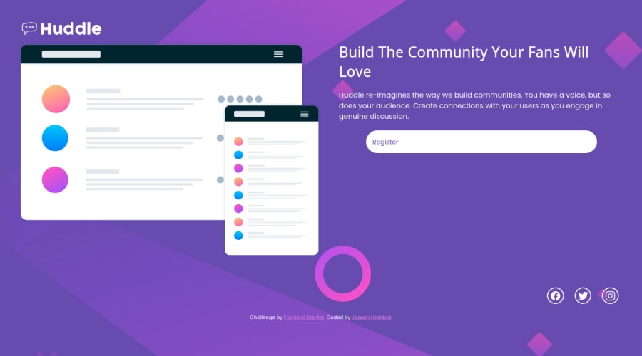
Design comparison
SolutionDesign
Solution retrospective
If there's anything, please let me know. Thanks
Community feedback
- @hyrongennikePosted over 2 years ago
Hi @joehaddad1000,
Nice job on the challenge
Just a few suggestion, you can replace your body rule with the following to center and space things out.
body {
    background-color: var(--Violet);
    background-image: url("./images/bg-mobile.svg");
    background-size: 100%;
    background-repeat: no-repeat;
    padding: 2.5rem;
    color: white;
    font-family: 'Poppins', sans-serif;
    min-height: 100vh;
    display: flex;
    flex-direction: column;
    justify-content: space-between;
}

main {
    flex-grow: 2;
    display: flex;
    align-items: center;
}
Hope this is helpful.
Marked as helpful0
Please log in to post a comment
Log in with GitHubJoin our Discord community
Join thousands of Frontend Mentor community members taking the challenges, sharing resources, helping each other, and chatting about all things front-end!
Join our Discord
