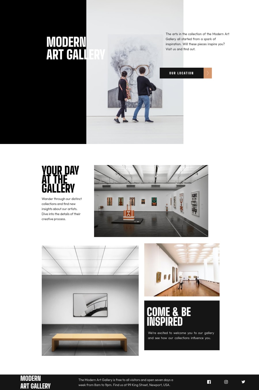
Design comparison
Solution retrospective
I really struggled with figuring out the best grid units and the best number of columns to properly line up the gallery photos. I would love some input on this!
Community feedback
- P@christopher-adolphePosted almost 3 years ago
Hi @tiffanicodes, 👋
You did a nice job in completing this challenge. 👍 I have recently completed the same project and I think I can give you some tips on how you could improve your solution or at least think of a different approach.
- I see that you have built the main content section using the
grid-areaproperty from CSS grid. While this is not a bad approach, it is not a flexible solution. Here are 2 resources that will surely help you come up with a more efficient layout. Travis Horn - Responsive grid, CSS-TRICKS - Responsive Grid - In order to render the hero title in black and white, you can apply the
mix-blend-modeproperty. It can have different values depending on the result you want to get, in the case of this challenge, theexclusionvalue does the job. 😉 Read more about it here. - The spacings in the footer section need to be reviewed as at the moment it looks wider than the header and main sections. I would suggest that you add a wrapping
<div class="container">element inside the different sections of your page to which you then apply amax-width. This will resolve the problem as well as on thelocationpage. - On the CSS side, I would suggest that you refrain from using
idas selectors to style elements as this hinders reusability.
I hope this helps.
Keep it up.
Marked as helpful1@tiffanicodesPosted almost 3 years ago@christopher-adolphe Thank you so much!! This was incredibly helpful and I really appreciate you sharing those resources. I will definitely check them out and see how I can improve.
0P@christopher-adolphePosted almost 3 years agoHi @tiffanicodes,
I'm happy to help and glad to see this was helpful to you. 🤝
Don't hesitate to dive into my git repository for this challenge, you may also find something useful there. 😉
See you on the next one.
Best regards.
1 - I see that you have built the main content section using the
- @farukingPosted almost 3 years ago
Well done. I had the same struggle also. You can also check my solution, you might find something helpful especially in the area of responsiveness.
1@tiffanicodesPosted almost 3 years ago@faruking thanks! It's nice to know I wasn't the only one struggling lol. I will definitely check out your solution to see how you approached this challenge.
0
Please log in to post a comment
Log in with GitHubJoin our Discord community
Join thousands of Frontend Mentor community members taking the challenges, sharing resources, helping each other, and chatting about all things front-end!
Join our Discord
