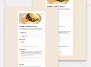
Design comparison
SolutionDesign
Solution retrospective
What are you most proud of, and what would you do differently next time?
- One opportunity to improve is that the final design of the mobile preview is not similar to the original design, for instance, the "Preparation time" section.
- Overall, the spacing around the bullet points could also be improved drastically.
- There were a few challenges that I encountered, one of them was using classes logically in my code. I have been struggling to use classes efficiently, especially in my CSS code.
- On one specific issue, I would really appreciate some help from the community. I was not able to make the color of the bullet points(dots) same as that of their heading.
- For instance, the color of the heading "Ingredients", and its bullet points(dots) should have been the same.
Community feedback
Please log in to post a comment
Log in with GitHubJoin our Discord community
Join thousands of Frontend Mentor community members taking the challenges, sharing resources, helping each other, and chatting about all things front-end!
Join our Discord
