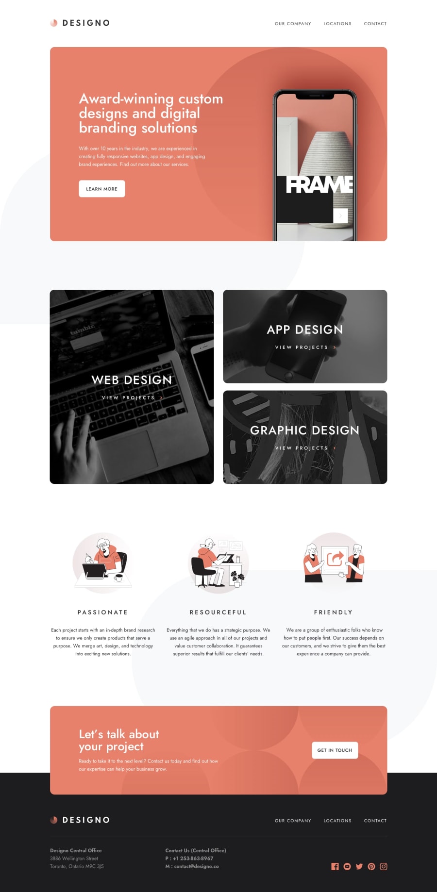
Responsive web using react, leaflet, react-router, formik, yup,
Design comparison
Solution retrospective
Being a beginner, this was a challenging project but I managed to finish it. The hardest part for me was writing CSS since I didn't use any external library like Tailwind. CSS is not optimized. I need to improve to write clean and optimized CSS if someone have some guidelines how to wirte optimized CSS it would be much appreciated. I learned a lot of new things and for the first time I used libraries such as Formik, Yup and Framer Motion. Any constructive critique is welcome.
Community feedback
- @better5afePosted about 1 year ago
Hi there, congrats on completing this challenge! 🎉
It looks very nice and everything is working as exepcted. I also had a look at your code and I must admit, it's written in a really neat way and is easy to be read by another developer. Nice!
However, there is one minor thing that could be improved - the textarea element on the contact page can be resized horizontally and sticks out of the form layout.
You can fix it by restricting the resizing direction to only vertical axis (add
resize: verticalto the textarea styles) or by setting the desired dimensions and block resizing entirely. Feel free to read more about this property on MDN.Other than that, I this is a very strong project, keep it up!
Marked as helpful0
Please log in to post a comment
Log in with GitHubJoin our Discord community
Join thousands of Frontend Mentor community members taking the challenges, sharing resources, helping each other, and chatting about all things front-end!
Join our Discord
